
Artificial intelligence (AI) has become a key technology in the 21st Century. Businesses use AI systems to analyse data, automate routine tasks, improve customer service, write software, create content and even assist with decision-making. As AI improves and becomes even more capable, governments, economists, businesses and society are debating its effects on productivity, employment and economic growth – and also its potentially extreme dangers.
Some commentators compare AI to earlier technological revolutions such as the steam engine, electricity and the Internet. They argue that AI will continue to increase productivity, create new industries and improve living standards. Others worry that AI may eliminate a large numbers of jobs, increase inequality, concentrate economic power in a few firms and, in the most extreme scenarios, pose a threat to humanity itself.
These debates raise important questions including how society should evaluate the potential risks of a technology whose benefits may be enormous but whose long-term consequences remain uncertain.
AI and the labour market
 Historically, technological change has had both positive and negative effects on employment. Automation reduced the demand for many agricultural workers, while creating jobs in manufacturing. Computers automated clerical tasks but generated entirely new industries in software, telecommunications and digital services.
AI appears likely to follow a similar pattern. According to the World Economic Forum, advances in AI, robotics and information-processing technologies are expected to transform labour markets significantly during the second half of the 2020s, creating demand for new skills while reducing demand for others. The fastest-growing skills are expected to include AI and big data, technological literacy and cybersecurity.
The potential benefits
AI may benefit labour markets in several ways:
- Higher productivity: Workers can complete tasks more quickly with AI assistance.
- New occupations: Demand has emerged for AI engineers, prompt specialists, data scientists and AI governance professionals.
- Better decision-making: Firms can use AI to improve forecasting, inventory management and customer service.
- Complementing human skills: AI may perform repetitive tasks, allowing employees to focus on creativity, problem-solving and interpersonal activities.
- Economic growth: Higher productivity can increase profits, wages and living standards over time.
Many economists argue that AI will not simply replace workers but will change the tasks they perform. Research from the OECD suggests that even highly AI-exposed occupations continue to require management, communication, collaboration and social skills that technologies struggle to replicate.
The potential costs
 At the same time, AI may create significant labour-market challenges. Many white-collar occupations previously considered relatively safe from automation are becoming vulnerable. Generative AI systems can draft reports, analyse legal documents, write computer code and create marketing content. This means that some professional and administrative roles may face considerable disruption.
The World Economic Forum reports that business leaders have differing expectations about the effects of AI. In a 2026 survey (see link below), around 54 per cent expected AI to displace existing jobs, while only 24 per cent expected it to create new jobs within their organisations. Economists have identified several potential problems:
- Structural unemployment: workers in industries that are in decline may struggle to find employment requiring their existing skills.
- Increased income inequality: there may be a growing income disparity between highly skilled and less-skilled workers.
- Growing market power: the largest technology firms that own the most advanced AI systems may see their market power grow further creating dominance in certain areas.
- Regional inequalities: AI-related investment may become concentrated in particular cities and countries, exacerbating regional inequalities within and between countries.
- Pressure on governments: to address issues of structural unemployment and increasing inequality, governments may be forced to expand retraining and social-support programmes.
AI and catastrophic risk
 Most economic discussion around AI focuses on employment and productivity. However, some researchers argue that the most significant risks from AI may be much broader.
Economists distinguish between ordinary risks and catastrophic risks. Catastrophic risks involve events with a very low probability of occurring but potentially enormous consequences. Examples include nuclear accidents, pandemics and certain climate-related disasters.
AI raises similar concerns. Advanced AI systems could potentially be used to conduct cyberattacks, spread misinformation, disrupt critical infrastructure or support the development of dangerous technologies. Some researchers have even suggested that highly advanced AI systems could pose an existential risk to humanity if they become sufficiently powerful and are not properly controlled.
This became a widely discussed topic in the media in September 2026 following the resignation of an employee, Jacob Coxon, from AI firm, Anthropic. He said that people working on AI were ‘genuinely frightened’ about how quickly AI was advancing and what it might mean for the future of humanity. He said:
I believe that if we don’t slow down at the current rate of progress, there is a strong chance that we could all die in the immediate future.
Other researchers have raised similar concerns and there have since been calls from some of the biggest AI companies for regulation of AI to prevent this.
The policy debate and CBA
 All of this creates a challenge for cost-benefit analysis. Suppose AI generates trillions of pounds of economic benefits. But, if there is also a very small probability of catastrophic harm, how should policymakers weigh up the two?
Traditional cost-benefit analysis values risk by multiplying the size of a potential outcome by its probability. However, this approach becomes problematic when both the probability and the consequences are highly uncertain. The risks may be extremely difficult to estimate, while the potential costs could be vast and affect future generations. For this reason, governments and firms increasingly use scenario analysis, stress testing and AI safety assessments to evaluate potential risks. These approaches attempt to prepare for extreme outcomes rather than relying solely on probability calculations.
Supporters of AI argue that technological progress has historically improved living standards and that restricting AI too heavily could reduce innovation and economic growth. Critics argue that uncertainty about potentially catastrophic outcomes justifies a more cautious approach.
The debate therefore extends beyond labour economics to the wider issue of managing catastrophic risk. As with nuclear power or climate change, policymakers must decide how much risk society is willing to accept in exchange for potentially large economic benefits.
Articles
- Why are there concerns AI could threaten humanity, and how real are they?
BBC News, Liv McMahon (17/9/26)
- Two dire warnings, one from Terence Tao, the other from someone who just quit Anthropic
Marcus on AI, Gary Marcus (9/9/26)
- AI insiders fear extinction. Security experts see a familiar fight
Scientific American, Peter Hall (11/9/26)
- US rejects pleas from OpenAI, Anthropic for global AI standards
BBC News, Kali Hays (24/9/26)
- How would AI actually kill all humans? Here are the top 5 scenarios
The Conversation, Toby Walsh (22/9/26)
- Who’s Who In The Fight Over Whether AI Will Kill Us
Forbes, Andréa Morris (24/9/26)
- Why this AI doomsday warning from former Anthropic researcher broke through
The Guardian, Blake Montgomery (15/9/26)
 As AI behavior raises concerns, ex-researcher Jacob Coxon warns what may lie ahead
PBS News
- ‘A setup’: Elon Musk fuels wild theory about Anthropic whistleblower Jacob Coxon
ABC News, Harrison Christian (11/9/26)
- Sam Altman, Dario Amodei urge UN Security Council to adopt international AI standards
CNN, Hadas Gold (24/9/26)
- Not everyone thinks AI will kill us all
CNN, Hadas Gold and Clare Duffy (24/9/26)
- The turbulent AI era is here. The choices we make now are critical.
Gates Notes, Bill Gates (26/8/26)
Reports
Questions
- How might AI increase productivity while also causing unemployment in some sectors? Which sectors are likely to be affected the most?
- Why is it difficult to estimate the costs and benefits of advanced AI?
- Assume that a disaster is estimated to cost society £1000 billion (£1 000 000 000 000). The chances of the disaster occurring are said to be minute, however. Estimates vary from a probability of one in a million to one in a billion. What estimate of this cost would you include in a cost–benefit analysis?
- Why are many low-income countries apparently prepared to accept riskier projects than are high-income ones?
- Discuss whether the greatest economic challenge posed by AI is (a) job displacement; (b) increased inequality; (c) market concentration and the power of large technology firms; or (d) catastrophic long-term risks.
- Read the article by Bill Gates, The turbulent AI era is here. The choices we make now are critical. According to him, what steps should the world take to ensure that ‘AI will be a force for good and leave everyone better off’?
 Wes Streeting and Andy Burnham are seeking to become UK Prime Minister in a challenge to Keir Starmer. They have both responded to an essay by Tony Blair, former Labour Prime Minister, where he argued that current Labour policies were holding back business. But the essay never mentioned inequality. According to Burnham and Streeting, inequality and the related issue of poverty are fundamental to the crises facing society in western democracies. Countries’ economic success is typically measured in terms of growth in GDP. But when the benefits of growth go largely to those at the top of the income scale, while people on lower incomes struggle to make ends meet, this feeds resentment. Populist politicians stoke such resentment and offer simplistic solutions, such as protectionism, blaming outsiders and promising a return to better times.
But just what has happened to inequality over recent years and has poverty deepened? How are inequality and poverty affecting people’s lives and what is the impact on the economy? And what policies should governments follow to tackle the problem?
Income inequality
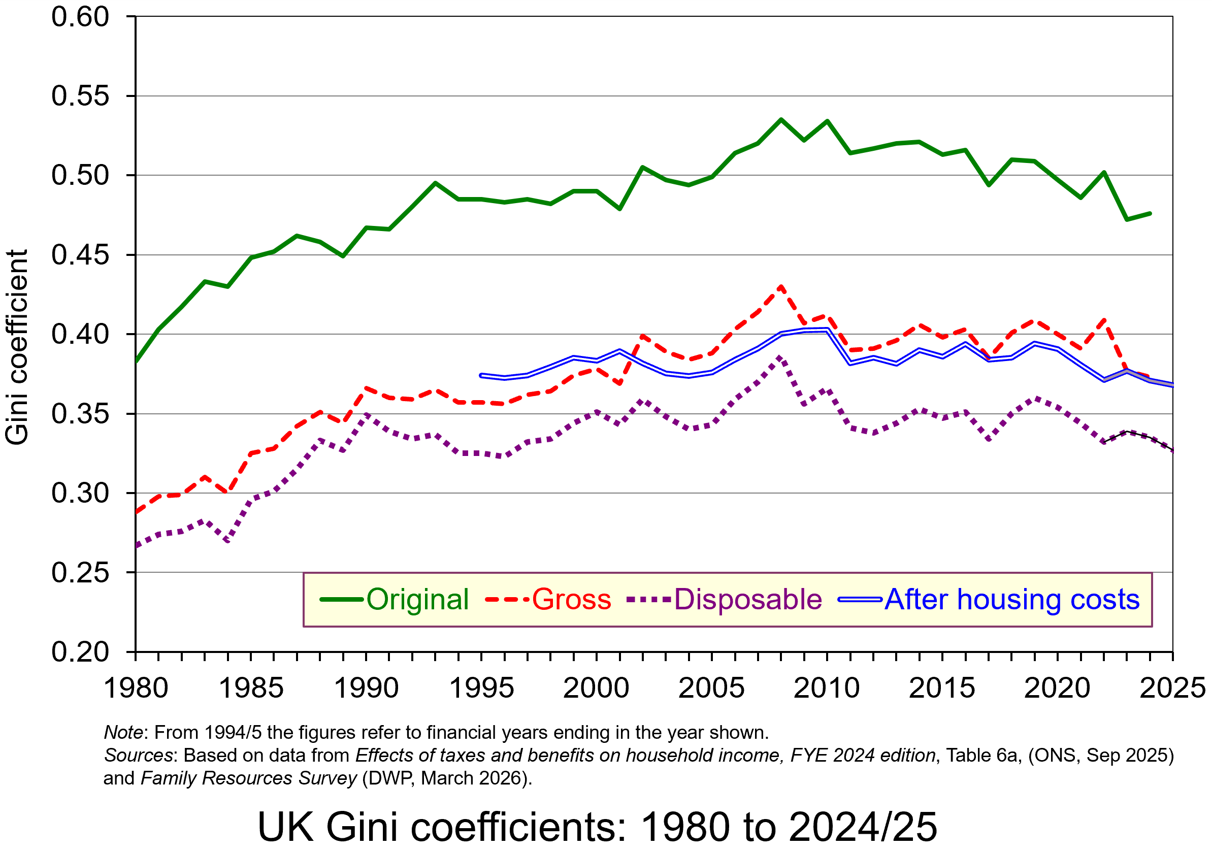 The chart shows UK inequality as given by the Gini coefficient, where 1 represents complete inequality, with one person earning the whole of national income and 0 represents perfect equality, with everyone earning the same. The higher the figure, therefore, the greater the inequality. As you can see, inequality is greatest when looking at original income – that is, income before taxes and benefits. Gross income includes benefits, and disposable income is income after both benefits and taxes. You can see that both benefits and taxes reduce inequality. When we take housing costs into account with the disposable income measure, however, inequality increases.
The chart shows that income inequality rose until the early 2000s, since when there have been only slight changes, although there has been a small decline recently.
The UK has higher income inequality than most high-income countries, although it is not as high as in the USA. It is sixth most unequal of the 38 OECD countries and the most unequal OECD member in Europe.
Globally, in 2025, the top 10% of the world’s population earned 53% of global income, while the bottom half earned just 8%. The reports listed below provide data and analysis on UK and global inequality.
Wealth inequality
 When we turn to wealth, inequality in the UK is even greater. The richest 10% of households hold around 41% of wealth, while the poorest 50% hold just under 10%. The Gini coefficient is around 0.6. This has been drive by a rise in property and share prices and the system of inheritance whereby family wealth can accumulate over the generations.
Globally, the top 10% of the world’s population held 75% of global wealth in 2025, whereas the bottom 50% held just 2%. And a tiny group of people – the top 0.001% of the adult population (about 56,000 individuals) – held about 6% of global wealth, up from 4% in 1995. Such extreme wealth inequality has thus increased.
Inequality and poverty
 There is no single measure of poverty. It could be measured in terms of basic needs. Here poverty would be where a person is unable to afford basic food, shelter, heating and lighting, clothing, footwear and basic toiletries. Normally, however, it is measured in relative terms. A typical measure, and one used by the Joseph Rowntree Foundation, is based on a proportion of median income. Poverty is defined as income below 60% of the median income, with deep poverty below 50% and very deep poverty below 40%.
In 2023/24, 14.2 million people were in poverty (20% of the population), of whom around 4.5 million were children. Of the 14.2 million, 6.8 million people (nearly half) were in very deep poverty,
 Causes of poverty include one or more of the following: low skills or education, low pay, unemployment, inadequate benefits or a benefit system that is confusing or difficult to access, chronic sickness, disability, unavailability or cost of suitable housing, discrimination, a breakdown of personal relationships, substance abuse, abuse from others, a criminal record. Once in poverty, it becomes difficult to escape as people become deskilled, demotivated and judged by society.
But even if people are not earning less than 60% of median income, they can still struggle to escape inequality. Many people have low skills; many routine jobs are being replaced by automation or AI; many graduates face high debts; people struggle to get on the housing ladder; the rising cost of basic items dampens real incomes, especially of the low paid; people may face discrimination of various sorts; people do not have an option of joining a union in their workplace; people may have a large number of dependants.
The policy agenda
If inequality rises up the political agenda in the UK, especially with a potential leadership race in the Labour party, what might politicians focus on? The government has already done the following:
- It has raised the minimum wage (the ‘National Living Wage’) substantially from £10.42 in 2023/24 to £11.44 in 2024/25, to £12.21 in 2025/26 and lowered the age limit from 23 to 21. There have been larger percentage rises for 18–20 year-olds and those under 18.
- The two-child limit to the child benefit element in Universal Credit has been scrapped and so now parents are eligible for benefits for all children.
- The Employment Rights Act has ended exploitative zero-hour contracts by providing rights to guaranteed hours.
- It has expanded free school meal entitlements.
- It has capped Universal Credit debt deductions at 15% of increased incomes (down from 25%) to help the poorest households retain more of their monthly income.
- It has expanded free school meals and made more money available for free nursery place.
- Landlords can no longer evict tenants for no reason; they must have a valid reason such as wanting to sell the property or severe rent arrears.
- Landlords cannot increase rents more than once per year and tenants can appeal excessive or above-market rent increases to an independent tribunal.
But despite these policy measures, many claim that they will do too little to tackle inequality and poverty. Some on the left argue that taxes on property and other forms of wealth will be required to tackle wealth inequality. Others argue that more emphasis on education and training is necessary to provide workers with the skills to earn more in the labour market. Others argue for greater expenditure on public services.
Generally, however, measures to tackle inequality and poverty require government expenditure, which must be funded. This is why many on the centre left argue that economic growth is a necessary condition for any significant redistribution. It is, they argue, the best way of providing the tax revenue to fund redistribution.
Incentives and disincentives
 Many on the right argue that redistributing incomes through higher taxes and benefits will act as a disincentive to work and to invest. As we argue in Essentials of Economics, higher income taxes could discourage people from working and investing; higher wealth taxes could discourage people from saving and investing.
The key to analysing these arguments is to distinguish between the income effect and the substitution effect of raising taxes. Raising income tax does two things.
- It reduces disposable incomes. People therefore are encouraged to work more in an attempt to maintain their consumption of goods and services. This is the income effect. ‘I have to work more to make up for the higher taxes’, a person might say.
- It reduces the opportunity cost of leisure. Since higher income taxes reduce take-home pay, an extra hour taken in leisure now involves a smaller sacrifice in consumption. Thus people may substitute leisure for consumption, and work less. This is called the substitution effect. ‘What is the point of doing overtime’, another person might say, ‘if so much of the overtime pay is going in taxes?’
The relative size of the income and substitution effects is likely to differ for different types of people. For example, the income effect is likely to dominate for those people with a substantial proportion of long-term commitments, such as those with families, with mortgages and other debts. They may feel forced to work more to maintain their disposable income. Clearly for such people, higher taxes are not a disincentive to work. The income effect is also likely to be relatively large for people on higher incomes, for whom an increase in tax rates represents a substantial cut in income.
The substitution effect is likely to dominate for those with few commitments: those whose families have left home, the single, and second income earners in families where that second income is not relied on for ‘essential’ consumption. A rise in tax rates for these people is likely to encourage them to work less.
Although high income earners may work more when there is a tax rise, they may still be discouraged by a steeply progressive tax structure. If they have to pay very high marginal rates of tax, it may simply not be worth their while seeking promotion or working harder.
What those on the centre and left argue is that tackling inequality and poverty requires more than just changing the tax and benefits system. What is required is policies that encourage greater upward social mobility, greater social cohesion and greater expenditure on infrastructure that will support the poor, such as greater expenditure on education and training, on support for very young children, on preventative healthcare, on social housing and on local public transport.
Articles
- Burnham and Streeting accuse Blair of ignoring inequality as they hit back at ex-PM
BBC News, Brian Wheeler and Richard Wheeler (27/5/26)
- Streeting and Burnham accuse Blair of failing to confront inequality in Labour criticism
The Guardian, Jessica Elgot (27/5/26)
- Alan Milburn is right, a young generation has been betrayed. Forget Tony Blair: we must attend to this
The Guardian, Polly Toynbee (28/5/26)
- Blair wants to leave our future to the markets. I believe democracy can still shape our lives for the better
The Guardian, Wes Streeting (27/5/26)
- New evidence on international inequality of opportunity – how does the UK rank?
The Sutton Trust, Opinion, Esme Lillywhite (25/9/25)
- Sorry, comrade Burnham. Inequality is a good thing
Telegraph on archive.today, Luke Johnson (29/5/26)
- Why America’s rich keep getting richer
CNN, David Goldman (29/5/26)
- Concern about inequality is not mere envy
LSE blogs, David Lay Williams (13/1/26)
- Are new technologies fuelling wage inequality? Evidence from Spain
LSE blogs, Raquel Sebastián, Pedro Salas-Rojo, Juan César Palomino and Juan Gabriel Rodríguez (24/3/26)
- 56,000 people own three times more wealth than half of humanity
LSE blogs, Ricardo Gómez-Carrera (12/5/26)
- The broad economic impact of inequality
Harvard Institute for Business in Global Society, Drew Keller and Susan Milligan (8/7/25)
- The New Inequality
Substack, Paul Krugman (31/5/26)
- Global Justice Report: the World Inequality Lab maps a path to €5,000-a-month average incomes for all countries within +1.8°C of warming
World Inequality Lab (4/6/26)
- ‘An equal and habitable world is possible’: academics set out sweeping vision for planetary survival
The Guardian, Jonathan Watts (4/6/26)
Reports
- Living standards, poverty and inequality in the UK
Institute for Fiscal Studies (26/3/26)
- Are fewer people living in poverty than previously thought?
Institute for Fiscal Studies, Jed Michael, Sam Ray-Chaudhuri and Tom Wernham (26/3/26)
- Income inequality in the UK
House of Commons Library, Brigid Francis-Devine (14/5/26)
- The Scale of Economic Inequality in the UK
Equality Trust
- Causes of inequality
Equality Trust
- UK Poverty 2026
Joseph Rowntree Foundation (27/1/26)
- Households Below Average Income: An analysis of the UK income distribution: FYE 1995 to FYE 2025
Department for Work & Pensions (26/3/26)
- Household income inequality, UK: financial year ending 2024
ONS (2/5/25)
- Unequal Chances: Children and economic inequality
UNICEF Innocenti (May 2026)
- To Have and Have Not – How to Bridge the Gap in Opportunities
OECD (22/9/25)
- World Inequality Report 2026
World Inequality Lab, Lucas Chance, Ricardo Gómez-Carrera (Lead Author), Rowaida Moshrif and Thomas Piketty
- The Global Justice Report
World Inequality Lab, L Chance, C Mohren, R Moshrif, M Odersky, T Piketty, A Somanchi, et al (4/6/26)
Data
Questions
- Is the UK becoming more or less equal? Does the answer depend on how inequality is measured?
- Is the world becoming more or less equal?
- Summarise the arguments against redistributing incomes from the rich to the poor.
- Summarise the arguments in favour of redistributing incomes from the rich to the poor.
- Explain the income and substitution effects of making income tax more progressive.
- How is the greater adoption of AI likely to affect income distribution?
- How does social mobility affect income distribution? What measures can be adopted to increase social mobility?
- Compare the relative merits and problems of raising income taxes, wealth taxes and expenditure taxes as means of redistributing incomes more equally.
 With relentless bombing of Iran by Israel and the USA, and with Iranian counterattacks on Gulf states, the costs of the war are mounting. The most obvious are in terms of human lives, injuries and suffering. But there are significant economic costs too. Some of these are immediate, such as the rising price of oil and hence the costs of fuel, or the fall in stock market prices. Some will be longer term, depending on how the war develops. For example, prices could rise more generally as supply chains are disrupted.
 The impacts will vary across the world and across markets. The most obvious markets to be affected are those where significant supply comes from the Persian Gulf. Approximately 20% of total global oil consumption passes through the Strait of Hormuz, which connects the Persian Gulf with the Arabian Sea and the Indian Ocean.
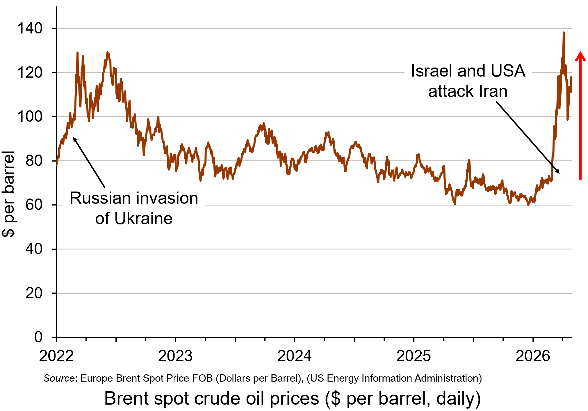
Oil prices rose considerably in the days following the start of the war on 28 February, with Brent crude, a key measure of international oil prices, rising from $71.3 on 27 February to a peak of $119.4 per barrel by the morning of 9 March – a rise of 67%. It was possible that they would rise even further in the short term. However, prices fell back substantially later on 9 March after G7 finance ministers declared that the group ‘stands ready’ to release oil from strategic reserves if needed. By late in the day, the price had fallen to below $85. (Click here for a PowerPoint of the chart.)
However, despite the announcement on 11 March that 32 countries had agreed to release 400m barrels of oil reserves, oil prices began rising again and reached $100 on 12 March after three tankers had been struck in the Gulf, two of them close to the Strait of Hormuz. With Iran pledging to keep the Strait closed, there were worries that the release of oil reserves would provide only temporary relief. Just over 20m barrels of oil normally pass through the Strait of Hormuz. The 400m barrels released from storage is the equivalent, therefore, of only 20 days’ worth of lost oil from the Gulf.
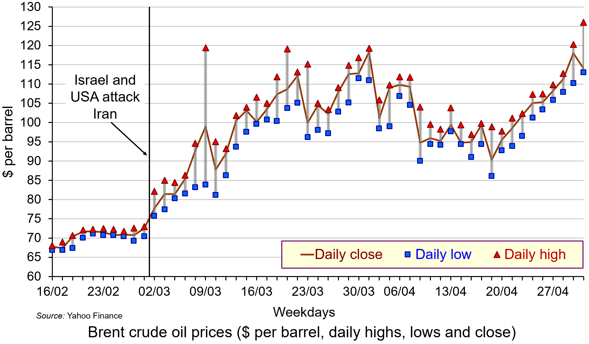
Not only did oil prices rise, but the price became much more volatile as markets reacted to the news on a continuous basis. Intra-day fluctuations in oil prices of several percentage points became typical, reflecting shifting expectations. The second chart shows daily fluctuations, with the highest and lowest prices for each day shown, along with the closing price. (Click here for a PowerPoint.)
The biggest fluctuation had been on 9 March when fears of the closing of the Strait of Hormuz saw the price of Brent crude rising to nearly $120 but falling to around $84 later in the day (a fall of around 30%) after the G7 announcement about releasing reserves.
There was another big fluctuation on 23 March. The previous day (Sunday), President Trump threatened to bomb Iran’s power plants if Iran did not allow free passage of ships through the Strait of Hormuz. Iran threatened to retaliate by striking Gulf countries’ energy and water systems. In early trading on Monday 23rd, Brent crude rose to over $115 per barrel. But later that day, Trump said that there had been constructive talks between the USA and Iran. The oil price immediately dropped to around $96 – a fall of 17% – before settling at around $100.
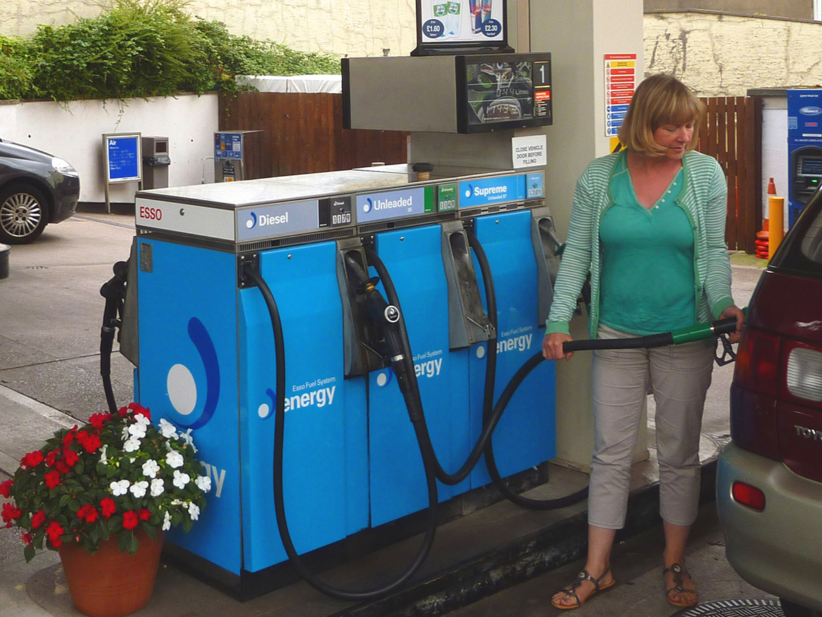 Rising oil prices will drive up inflation. For those countries with a heavy dependence on Gulf oil, particularly countries in Asia, there could be significant supply problems. For oil exporters in the Persian Gulf, with tankers unable to traverse the Strait of Hormuz, the economic impact is huge. Oil exporters outside the Gulf, such as Russia, Norway and Canada, however, will gain from the higher prices. Clearly the size of these effects will depend on how long the conflict continues and how long the Strait of Hormuz remains closed.
And it is not just oil that is affected. Other products, such as liquified natural gas (LNG), petrochemicals, industrial materials, fertilizers for food production, medicines, helium for microchip production, metals and minerals are transported through the Strait of Hormuz. Gulf countries import much of their food through the Strait. On 18 March, Israel struck Iran’s huge South Pars gas field off the Gulf coast. This is the largest gas field in the world and is a major source of export revenue for Iran. Iran responded by striking the Qatari gas hub in Ras Laffan. Donald Trump responded by threatening to ‘blow up’ the entire Iranian South Pars gas field if Iran made further strikes on Qatar. The effect of this escalation was to drive oil and gas prices up further. By the week ending 20 March, the oil price closed at just over $112 per barrel.
Cuts in supplies of oil and other products represent an adverse supply shock. Such shocks push up prices (cost-push inflation), while adversely affecting aggregate output. This can lead to stagflation – a combination of higher inflation and stagnation or even falling output. Central banks with a simple mandate to keep inflation to a target are likely to raise interest rates, or at least delay in reducing them. In the USA, with a dual mandate of controlling inflation but also maximising employment, the response may be less deflationary, depending on the judgement of the Federal Reserve.
Uncertainty
 There is great uncertainty about how long the conflict will last. There is also a lack of clarity and consistency from the US administration about its war aims. This uncertainty has affected financial markets, which have seen considerable volatility. Stock markets have seen widespread falls, with airline, travel and AI-heavy stocks being particularly vulnerable.
If the war is concluded relatively swiftly, the economic effects could be relatively small. If the war continues, and especially if the Gulf countries are drawn further into the conflict and if the conflict spreads to other countries, the economic effects could be much more substantial. A prolonged conflict could see oil prices remaining above $100 per barrel, potentially increasing global inflation by 1 percentage point or more. This would slow or halt the move by central banks to cut rates and thereby reduce global economic growth – potentially, as we have seen, leading to stagflation.
 The uncertainty was reflected in the decision of the Fed to keep interest rates unchanged at its meeting on 17/18 March. The Fed has the twin targets of keeping inflation close to 2% and maximising employment. Fed Chair, Jay Powell, acknowledged the current tension between the two goals: ‘upward risks for inflation and downward risks for employment, and that puts us in a difficult situation’. He also recognised that the future for inflation and the economy was highly uncertain as the war developed. This made interest rate setting difficult.
Then there is the issue of a potential new international refugee crisis. If the economic and political system in Iran deteriorates rapidly, this could trigger a wave of migration to neighbouring countries, such as Turkey, already hosting large numbers of refugees. Many could seek sanctuary further afield in Europe, with several countries already facing a backlash against immigration. The political and economic effects of this on host countries could be significant – but as yet, highly uncertain.
Articles
- Assessing the global economic impact of the Middle East war
ING, Carsten Brzeski, Warren Patterson, James Knightley and Deepali Bhargava (5/3/26)
- How the Hormuz closure could affect food, medicines and smartphones
BBC News Verify, Ben Chu (27/3/26)
- How will the Iran war affect the global economy?
Chatham House, Neil Shearing (6/3/26)
- ‘The stakes are enormous’: how a prolonged Iran war could shock the global economy
The Guardian, Richard Partington (22/3/26)
- Iran war is latest threat to a global economy rattled by Trump
Aljazeera, John Power (7/3/26)
- Why an Iran war inflation shock could wreck global economic recovery
The Guardian, Phillip Inman and Kalyeena Makortoff (8/3/26)
- Why has the Iran war sparked fears of stagflation for the global economy?
The Guardian, Luca Ittimani (9/2/26)
- Why the price of oil matters more than you might think
BBC News, Natalie Sherman and Mitchell Labiak (10/3/26)
- Strait of Hormuz: Factsheet
IEA (February 2026)
- Could this energy crisis be worse for the global economy than COVID?
The Conversation, Adi Imsirovic (26/3/26)
- Faisal Islam: Oil price spiral may be slowed but not stopped by G7 emergency move
BBC News, Faisal Islam (9/3/26)
- What on earth is going on with the oil price?
BBC News, Jemma Crew (12/3/26)
- Asia scrambles to confront energy crisis unleashed by Iran war – with no end in sight
The Guardian, Callum Jones (12/3/26)
- The grim choice facing the Trump administration: Economic or naval collapse?
CNN, Phil Mattingly and Zachary Cohen (9/3/26)
- Israel strikes Iran’s South Pars gasfield hours after forces kill intelligence minister
The Guardian, Lorenzo Tondo and William Christou (18/3/26)
- What Fed Chair Jerome Powell said — and didn’t say — about the oil crisis
Yahoo Finance, Jake Conley (19/3/26)
- What strikes on the world’s largest natural gas sites could do to the global economy
CNN, Hanna Ziady (19/3/26)
- How the Iran Conflict May Fuel a New International Refugee Crisis
Forbes, Andy J Semotiuk (5/3/26)
- Iran’s neighbours brace for fallout as war threatens new refugee crisis
Aljazeera, Abid Hussain (17/3/26)
- Two months into the Iran war, almost everybody is a loser
CNN, Ivana Kottasová (2/5/26)
Data
Report
Questions
- Who are the biggest gainers and losers from disruption to oil supplies from the Persian Gulf?
- Illustrate the effect of the current oil price shock on an aggregate demand and supply diagram (either static or dynamic).
- Why is the Iranian war likely to be less damaging to the European economy than the Ukrainian war has been?
- Why have AI-related stock prices been vulnerable to the uncertainty caused by the Iranian war?
- How have the Bank of England and the Federal Reserve Bank responded to higher oil prices and the broader economic effects of the war? Why might their responses be different in the coming months?
- What is the likely impact of the Iranian war on global economic recovery?
- How might the Iranian war affect global economic alliances?
- How is the current oil price shock likely to affect the eurozone? Will it be different from the oil price shock that followed the Russian invasion of Ukraine?
- What are the likely economic effects of large-scale migration caused by the war?
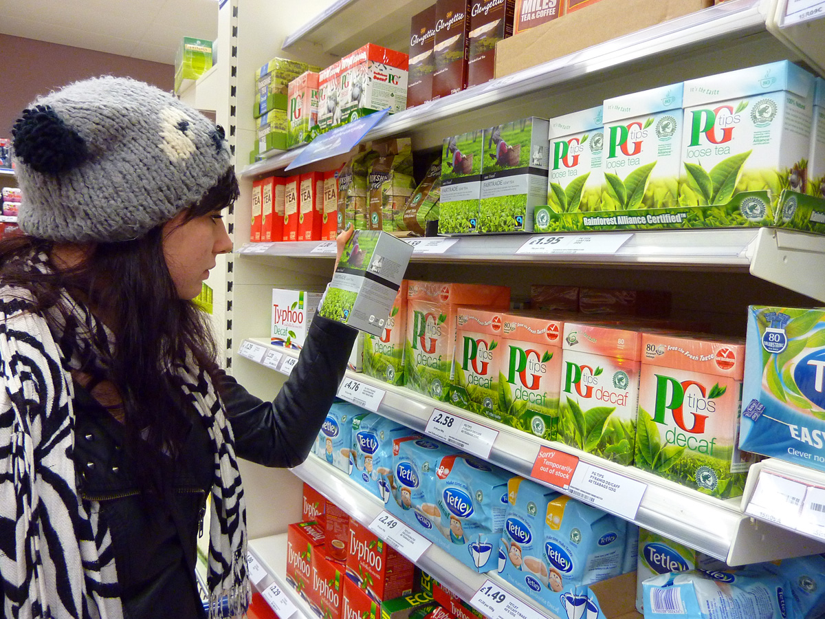 Have you noticed that many products in the supermarket seem to be getting smaller or are poorer quality, or that special offers are not as special as they used to be? When you ring customer services, does it seem that you have to wait longer than you used to? Do you now have to pay for extras that used to be free? These are all ways that producers try to pass on cost increases to consumers without rising prices. There are three broad ways in which producers try to hide inflation.
The first is called ‘shrinkflation’. It is defined as having less product in the same package or a smaller package for the same price. For example, reducing the number of chocolates in a tub, reducing the size of a can of beans, jar of coffee or block of butter, reducing the number of sheets in a toilet roll, or the length of a ride in a fairground or portion sizes in a restaurant or takeaway. A 2023 YouGov poll revealed that 75% of UK adults are either ‘very’ or ‘fairly’ concerned about shrinkflation. A similar poll in 2025 showed that this figure had increased to 80%. The product category with the greatest concerns was snack foods (e.g. crisps, confectionery items, nuts, etc.).1
The second form of hidden inflation is called ‘skimpflation’. This is defined as decreasing the quality of a product or service without lowering the price. Examples include cheaper ingredients in food or confectionery, such as using palm oil instead of butter, or reducing the cocoa content in chocolate or the meat content in sausages and pies, or package holidays reducing the quality of meals, or customer service centres or shops reducing the number of staff so that people have to wait longer on the phone or to be served.
The third is called ‘sneakflation’. This is similar to skimpflation but normally refers to reducing what you get when you pay for a service, such as a flight, by now charging for extras, such as luggage or food. Sometimes shrinkflation or skimpflation are seen as subsets of sneakflation.
 These practices have had a lot of publicity in recent months, with consumers complaining that they are getting less for their money. Many people see them as a sneaky way of passing on cost increases without raising the price. But the changes are often subtle and difficult for shoppers to spot when they are buying an item. Skimpflation especially is difficult to observe at the time of purchase. It’s only when people consume the product that they think that it doesn’t seem as good as it used to be. Even shrinkflation can be hard to spot if the package size remains the same but there is less in it, such as fewer biscuits in a tin or fewer crisps in a packet. People would have to check the weight or volume, while also knowing what it used to be.
If firms are legitimately passing on costs and are up-front about what they are doing, then most consumers would probably understand it even if they did not like it. It’s when firms do it sneakily that many consumers get upset. Also, firms may do it to increase profit margins – in other words, by reducing the size or quality beyond what is necessary to cover the cost increase.
Does the official rate of inflation take such practices into account?
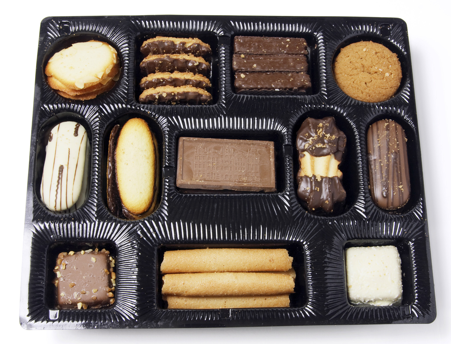 The answer is that some of the practices are taken into account – especially shrinkflation. The Office for National Statistics (ONS) accounts for shrinkflation by monitoring price changes per unit of weight or volume, rather than just the price. Data collectors track the weight, volume or count of item. When a product’s size is reduced, the ONS records this as a price increase in CPI or CPIH inflation statistics. This is known as a ‘quality adjustment’ process and allows the ONS to isolate price changes from product size changes. As CPI data from the ONS is used by the Bank of England in monitoring its 2% inflation target, it too is incorporating shrinkflation.
ONS quality adjustments are also applied to non-market public services, such as healthcare, education and policing to measure changes in service quality rather than just volume. This allows a more accurate measurement of productivity as it focuses on outcomes and user experience per pound spent rather than just focusing on costs.
Skimpflation is more difficult to monitor. The quality adjustment process may miss some quality changes and hence some skimpflation goes unrecorded. This means that the headline inflation rate might understate the true decline in purchasing power felt by consumers.
How extensive is hidden inflation?
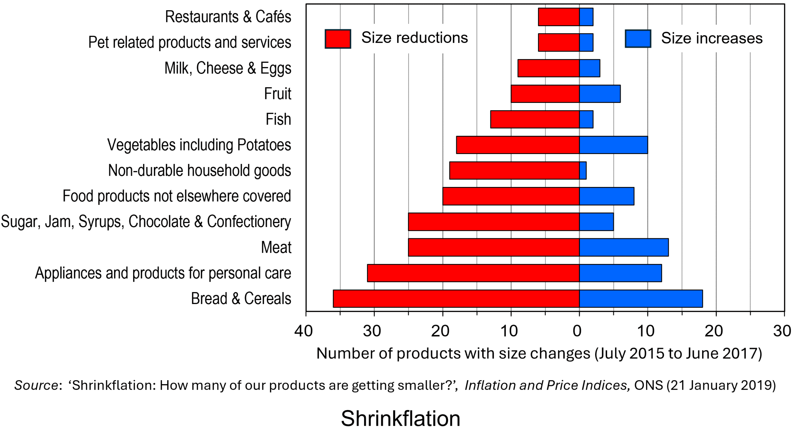
Despite public perception, shrinkflation has a relatively small impact on the headline CPI and CPIH inflation rate in the UK because it is largely confined to certain sectors, such as bread and cereals, personal care products, meat products, and sugar, jams, syrups, chocolate & confectionery. Nevertheless, in these sectors it is particularly prevalent, especially in the packaged foodstuffs and confectionery sector. The latest research by the ONS in 2019 covered the period June 2015 to June 2017 and is shown in the following figure.2
According to research in the USA by Capital One Shopping, some major brands reduced product sizes by over 30% in 2025 without reducing prices, with shrinkflation averaging 14.8% among selected national grocery brands.3 Shrinkflation had been observed by 74% of Americans at their grocery store. Of these, 81% took some kind of action as a result, with 48% abandoning a brand. Nevertheless, across all products, shrinkflation accounts for quite a small percentage of any overall price rises.
A US Government Accountability Office (GAO) report found that shrinkflation accounted for less than 1/10 of a percentage point of the 34.5% increase in overall consumer prices from 2019 to 2024.4 The reason is that the items that were downsized comprised a small percentage of goods and services. Indeed, many goods and services, such as housing, cannot be downsized in the same way that household products can.
Nevertheless, with consumer budgets being squeezed by the inflation that followed the pandemic and the Russian invasion of Ukraine, hidden inflation has become more prevalent in many countries and an increasing concern of consumers.
References
- Shrinkflation concern rises in 2025, but fewer Britons are changing shopping habits
YouGov (15/8/25)
- Shrinkflation: How many of our products are getting smaller?
Office for National Statistics (21/1/19)
- Shrinkflation Statistics
Capital One Shopping (30/12/25)
- What is “Shrinkflation,” And How Has It Affected Grocery Store Items Recently?
U.S. Government Accountability Office (12/8/25)
Videos
Articles
- Shrinkflation: How many of our products are getting smaller?
Office for National Statistics (21/1/19)
- Shrinkflation: Inflation hiding in plain sight
Britannica Money, Doug Ashburn (21/7/25)
- Shrinkflation: the brands charging you more for less
Which?, Ellie Simmonds (28/10/25)
- 7 Surprising Ways Inflation Is Still Rising Even as Prices Slow This Year
SavingAdvice.com, Teri Monroe (3/2/26)
- 22 Real-Life Examples Of Shrinkflation That People Have Spotted In The Last Few Weeks That Are Honestly Infuriating
BuzzFeed, Megan Liscomb (10/12/25)
- Shrinkflation: smaller products hurt some households more than others – and can be bad for business
The Conversation, Erhan Kilincarslan (14/1/26)
- Shoppers brand the UK “a disgrace” as Cadbury Mini Egg prices rise by 105% on pre-pandemic levels
Food Manufacture, Thomas West (6/1/26)
- This article is more than 3 months old Shrinkflation hits everyday staples, piling more pressure on households
The Guardian, Sarah Marsh and Sarah Butler (28/12/25)
- Shrinkflation isn’t slowing down — It’s just getting harder to spot
ConsumerAffairs, Kyle James (13/1/26)
- Shrinkflation – are brands and supermarkets required to inform consumers if a product has been reduced in size or quantity but the packaging looks the same?
CMS Law-Now, Loïc de Hults and Tom Heremans (25/9/25)
- Study reveals shrinking package sizes hide significant food inflation
Phys.org, Aaron Kupec (28/1/26)
Journal Article
Questions
- If shrinkflation, when included in CPI statistics, accounts for such a small percentage of inflation, why are people so concerned about it?
- From a company’s perspective, is it a good idea to engage in (a) shrinkflation; (b) skimpflation?
- Go round you local supermarket and identify examples of shrinkflation and skimpflation.
- How are various EU countries attempting to inform consumers of shrinkflation?
- Why is skimpflation often harder to detect than shrinkflation?
- Give some other examples of sneakflation in the provision of services.
- How could behavioural economists help firms decide whether or how to engage in shrinkflation or skimpflation?
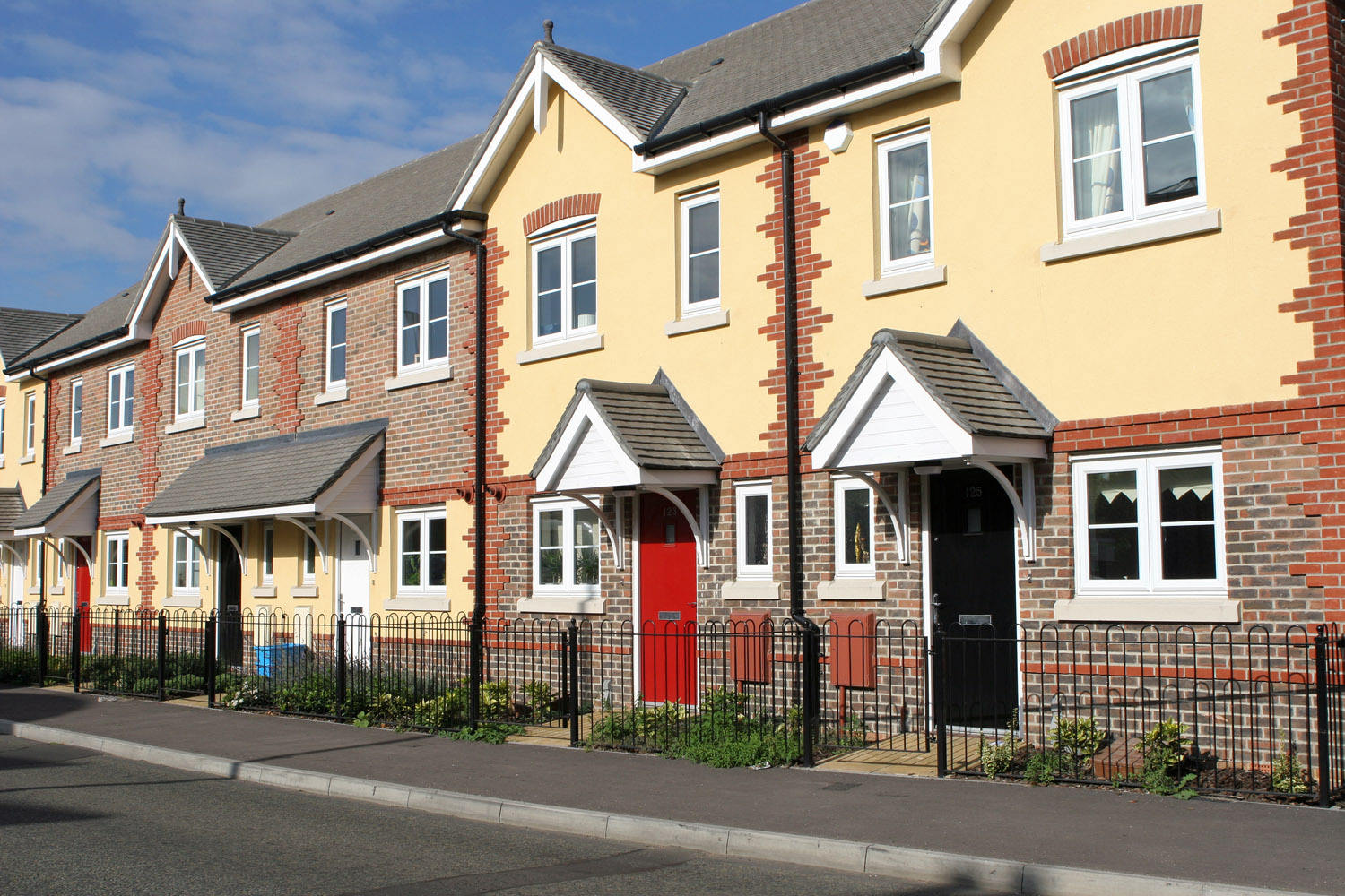 When I worked as a professional economist at HM Treasury and later the Council of Mortgage Lenders (now part of UK Finance), I would regularly brief on the state of the affordability of housing, with a particular focus on the owner-occupied market. That was back in the late 1990s. Fast forward a quarter of a century and I recognise not only how much I have aged but also how deep-rooted and long-standing the affordability problem is.
It is perhaps not surprising that in her first speech as the new Chancellor of the Exchequer, Rachel Reeves, referenced directly the housing market and the need to address supply-side issues. She has set a target of one and a half million new homes built over the next five years.
It is therefore timely to revisit the trends in house prices across the UK. By applying the distinction between nominal and real values we get a very clear sense of the deteriorating affordability of housing.
Nominal house price patterns
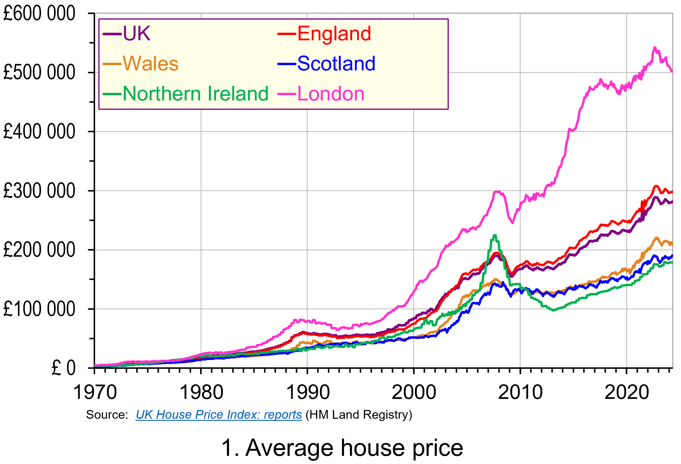 The average UK actual or nominal house price in April 2024 was £281 000. As Chart 1 shows, this masks considerable differences across the UK. In England the average price was £298 000 (105 per cent of the UK average), though this is heavily skewed by London where the average price was £502 000 (178 per cent of the UK average). Meanwhile, in Scotland it was £190 000 (68 per cent of the UK average), in Wales £208 000 (74 per cent of the UK average) and in Northern Ireland it was £178 000 (74 per cent of the UK average). (Click here to download a PowerPoint copy of the chart.)
A simple comparison of the average house price in April 2024 with January 1970 reveals a 72-fold increase in the UK, an 80-fold increase in England, including a 101-fold increase in London, a 65-fold increase in Wales, a 59-fold increase in Scotland and a 45-fold increase in Northern Ireland. Whilst these figures are sensitive to the particular period over which we choose to measure, there is little doubting that upward long-term trend in house prices.
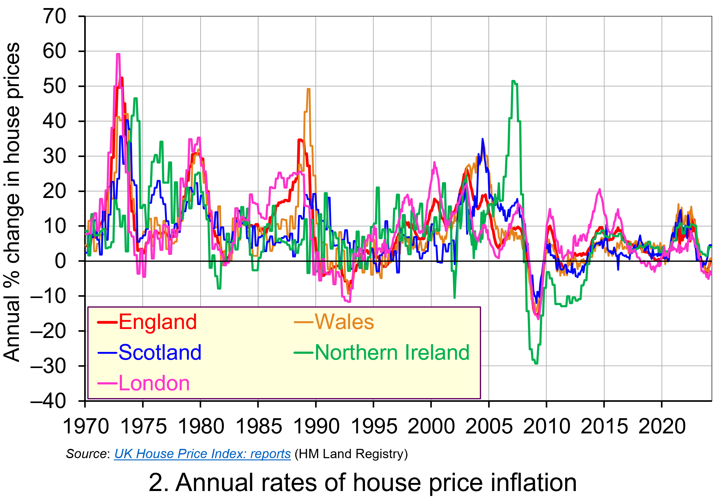 Whilst nominal prices trend upwards over time, the short-term rates of increase are highly volatile. This can be seen from an inspection of Chart 2, which shows the annual rates of increase across the four nations of the UK, as well as for London. This is evidence of frequent imbalances between the flows of property on to the market to sell (instructions to sell) and the number of people looking to buy (instructions to buy). An increase in instructions to buy (housing demand) relative to those to sell (housing supply) puts upward pressure on prices; an increase in the number of instructions to sell (housing supply) relative to those to buy (housing demand) puts downward pressure on prices. (Click here to download a PowerPoint copy of the chart.)
Chart 2 nicely captures the recent slowdown in the housing market. The inflationary shock that began to take hold in 2021 led the Bank of England to raise Bank Rate on 15 occasions – from 0.25 per cent in December 2021 to 5.25 per cent in August 2023 (which remains the rate at the time of writing, but could be cut at the next Bank of England meeting on 1 August 2024). Higher Bank Rate has pushed up mortgage rates, which has contributed to an easing of housing demand. Demand has also been dampened by weak growth in the economy, higher costs of living and fragile consumer confidence. The result has been a sharp fall in the rate of house price inflation, with many parts of the UK experiencing house price deflation. As the chart shows, the rate of deflation has been particularly pronounced and protracted in London, with house prices in January 2024 falling at an annual rate of 5.1 per cent.
Real house price patterns
Despite the volatility in house prices, such as those of recent times, the longer-term trend in house prices is nonetheless upwards. To understand just how rapidly UK house prices have grown over time, we now consider their growth relative to consumer prices. This allows us to analyse the degree to which there has been an increase in real house prices.
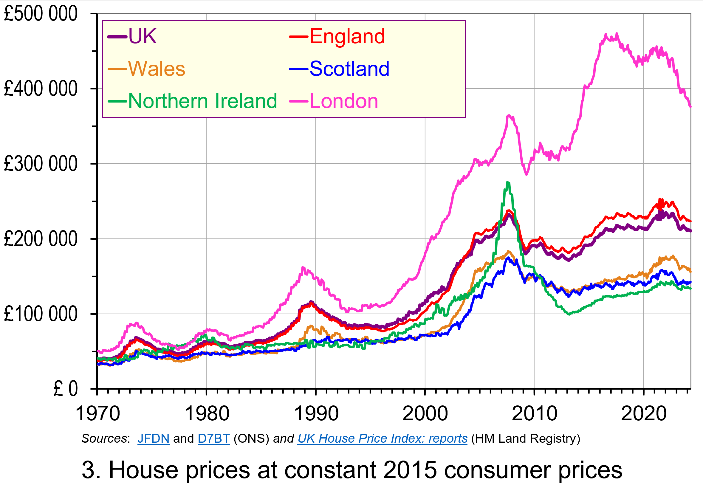 To calculate real or inflation-adjusted house prices, we deflate nominal house prices by the Consumer Prices Index (CPI). Chart 3 shows the resulting real house prices series across the UK as if consumer prices were fixed at 2015 levels.
The key message here is that over the longer-term we cannot fully explain the growth in actual (nominal) house prices by the growth in consumer prices. Rather, we see real increases in house prices. Inflation-adjusted UK house prices were 5.3 times higher in April 2024 compared to January 1970. For England the figure was 5.9 times, Wales 4.8 times, Scotland 4.3 times and for Northern Ireland 3.3 times. In London, inflation-adjusted house prices were 7.4 times higher. (Click here to download a PowerPoint copy of the chart.)
As we saw with nominal house prices, the estimated long-term increase in real house prices is naturally sensitive to the period over which we measure. For example, the average real UK house price in August 2022 was 5.8 times higher than in January 1970, while in London they were 8.7 times higher. But the message is clear – the long-term increase is not merely nominal, reflecting increasing prices generally, but is real, reflecting pressures that are increasing house prices relative to general price levels.
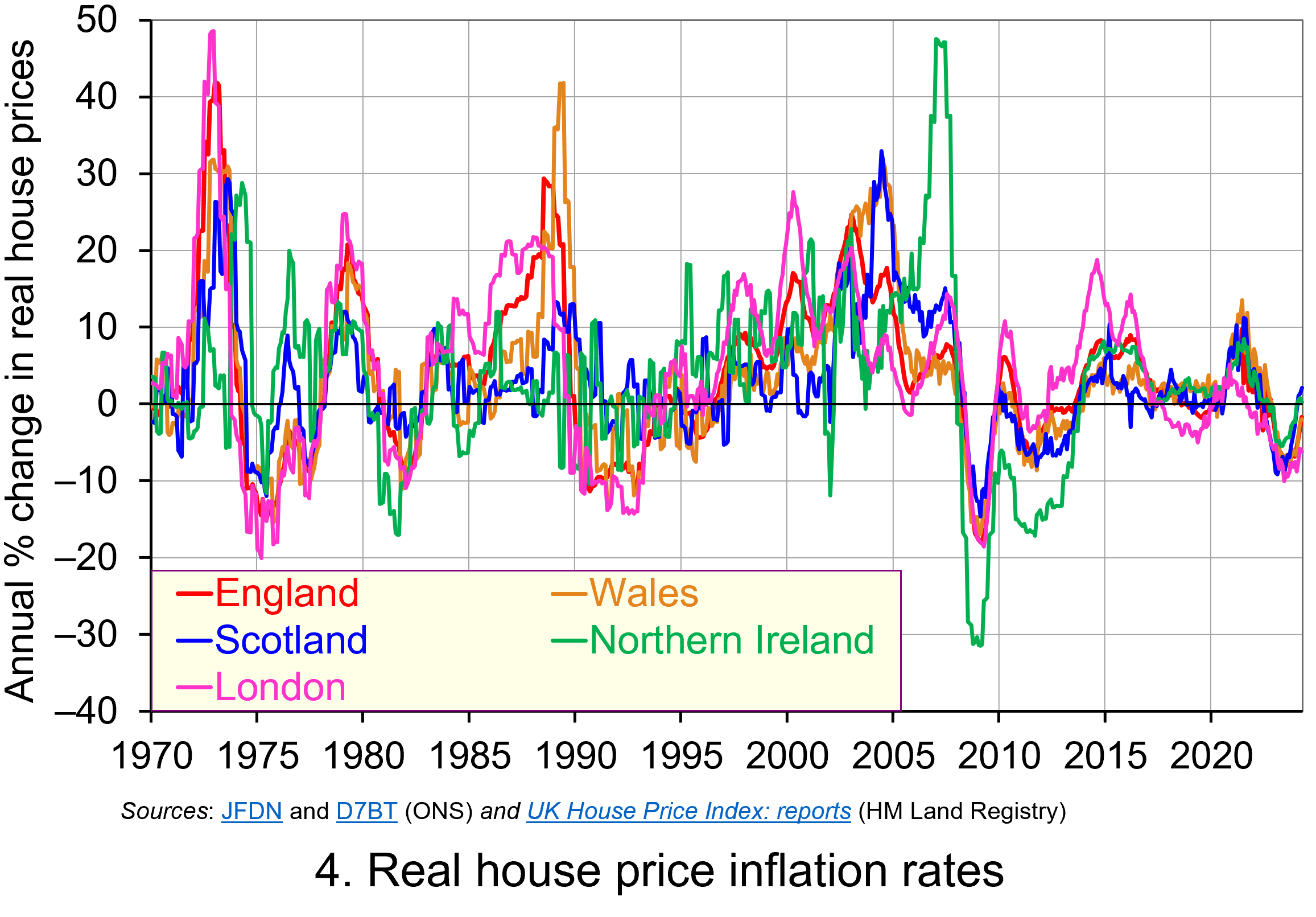 Chart 4 shows how the volatility in house prices continues to be evident when house prices are adjusted for changes in consumer prices. The UK’s annual rate of real house price inflation was as high as 40 per in January 1973; on the other hand, in June 1975 inflation-adjusted house prices were 15 per cent lower than a year earlier. (Click here to download a PowerPoint copy of the chart.)
Over the period from January 1970 to April 2024, the average annual rate of real house price inflation in the UK was 3.2 per cent. Hence house prices have, on average, grown at an annual rate of consumer price inflation plus 3.2 per cent. For the four nations, real house price inflation has averaged 3.8 per cent in England, 3.4 per cent in Wales, 3.0 per cent in Scotland and 2.9 per cent in Northern Ireland. Further, the average rate of real house price inflation in London since January 1970 has been 4.5 per cent. By contrast, that for the East and West Midlands has been 3.7 and 3.5 per cent respectively. The important point here is that the pace with which inflation-adjusted house prices have risen helps to contextualise the extent of the problem of housing affordability – a problem that only worsens over time when real incomes do not keep pace.
House building
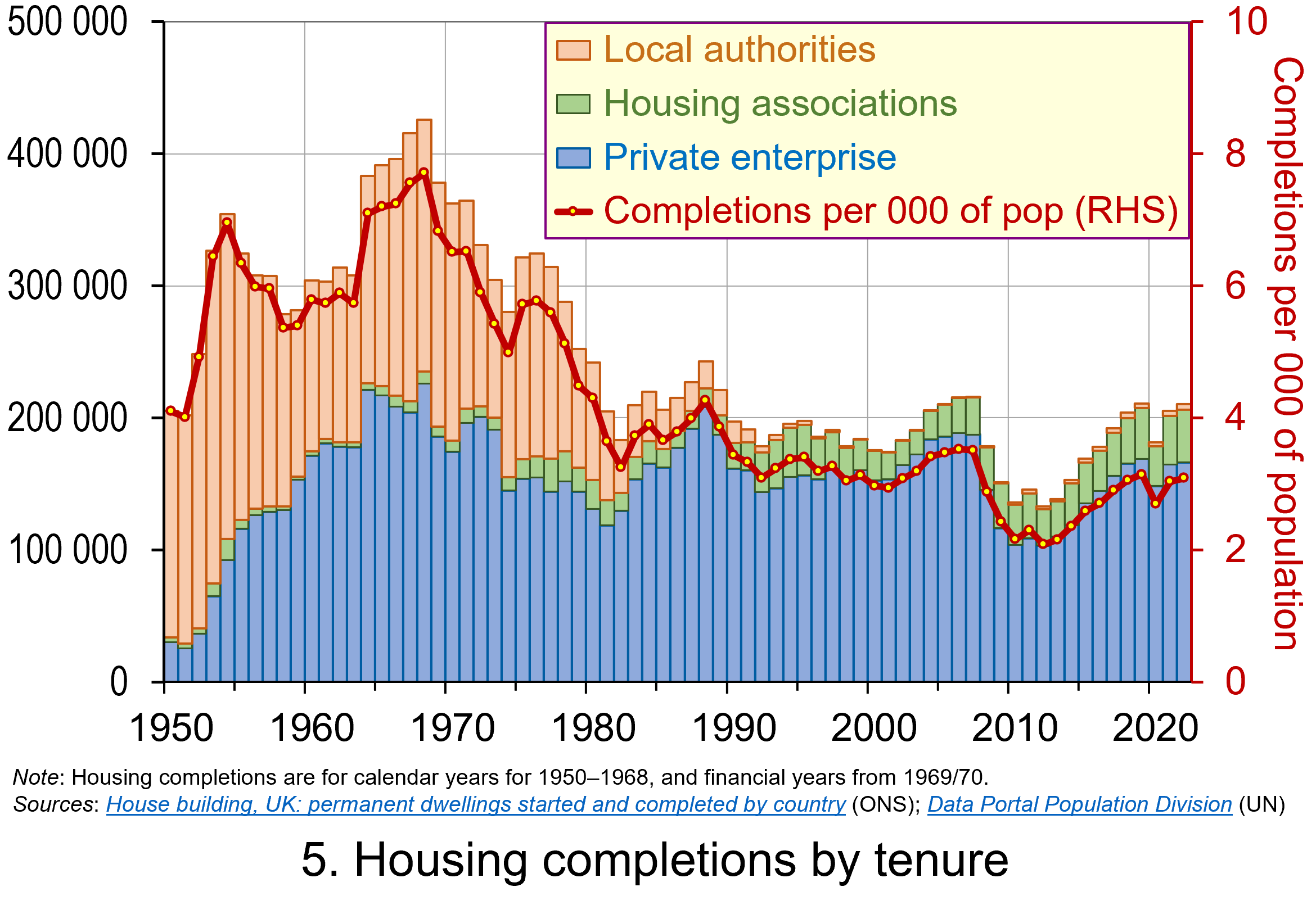 The newly elected Labour government has made the argument that it needs to prioritise planning reform as an engine for economic growth. While this ambition extends beyond housing, the scale of the supply-side problem facing the housing market can be seen in Chart 5. The chart shows the number of housing completions in the UK since 1950 by type of tenure. (Click here to download a PowerPoint copy of the chart.)
The chart shows the extent of the growth in house building in the UK that occurred from the 1950s and into the 1970s. Over these three decades the typical number of new properties completed each year was around 320 000 or 6 per thousand of the population. The peak of house building was in the late 1960s when completions exceeded 400 000 per year or over 7.5 per thousand of the population. It is also noticeable how new local authority housing (‘council houses’) played a much larger role in the overall housing mix.
Since 1980, the average number of housing completions each year has dropped to 191 000 or 3.2 per thousand of the population. If we consider the period since 2000, the number of completions has averaged only 181 000 per year or 2.9 per thousand of the population. While it is important to understand the pressures on housing demand in any assessment of the growth in real house prices, the lack of growth in supply is also a key factor. The fact that less than half the number of properties per thousand people are now being built compared with half a century or so ago is an incredibly stark statistic. It is a major determinant of the deterioration of housing affordability.
However, there are important considerations around the protection of the natural environment that need to be considered too. It will therefore be interesting to see how the reforms to planning develop and what their impact will be on house prices and their affordability.
Articles
- Rachel Reeves requests urgent assessment of spending inheritance
The Guardian, Larry Elliott (8/7/24)
- Reeves to bring back housebuilding targets
BBC News, Faisal Islam and Daniel Thomas (8/7/24)
- UK Chancellor Reeves Vows to Fix Broken Planning System for Housebuilding
Bloomberg UK, Tom Rees, Damian Shepherd, and Joe Mayes (8/7/24)
- What to expect for house prices for the rest of 2024
i News, Callum Mason (10/7/24)
- UK house prices still unaffordable for many people, says Nationwide
The Guardian, Richard Partington (1/7/24)
- House prices still unaffordable for the average earner despite wage rises – Nationwide
Sky News, Sarah Taaffe-Maguire (1/7/24)
- Labour cannot build 1.5m homes without cash for affordable housing, providers say
The Guardian, Jack Simpson (12/7/24)
Statistics
Questions
- Explain the difference between a rise in the rate of house price inflation a rise in the level of house prices.
- Explain the difference between nominal and real house prices.
- If nominal house prices rise can real house price fall? Explain your answer.
- What do you understand by the terms instructions to buy and instructions to sell?
- What factors are likely to affect the levels of instructions to buy and instructions to sell?
- How does the balance between instructions to buy and instructions to sell affect house prices?
- How can we differentiate between different housing markets? Illustrate your answer with examples.
- What metrics could be used to measure the affordability of housing?
- Discuss the argument that the deterioration of housing affordability is the result of market failure.
