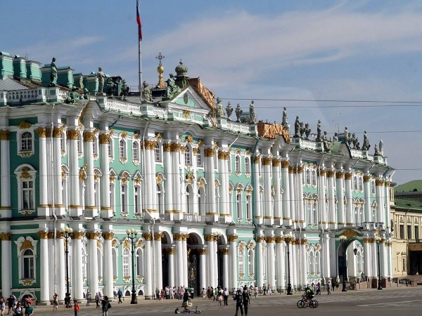
 Many important economic changes have occurred over the past two years and many have occurred in the past two months. Almost all economic events create winners and losers and that is no different for the Russian economy and the Russian population.
There is an interesting article plus videos on the BBC News website (see link below), which consider some of the economic events that, directly or indirectly, have had an impact on Russia: the fall in oil prices; the conflict between Russia and the Ukraine; the fall in the value of the rouble (see chart); the sanctions imposed by the West.
Clearly there are some very large links between events, but an interesting question concerns the impact they have had on the everyday Russian consumer and business. Economic growth in 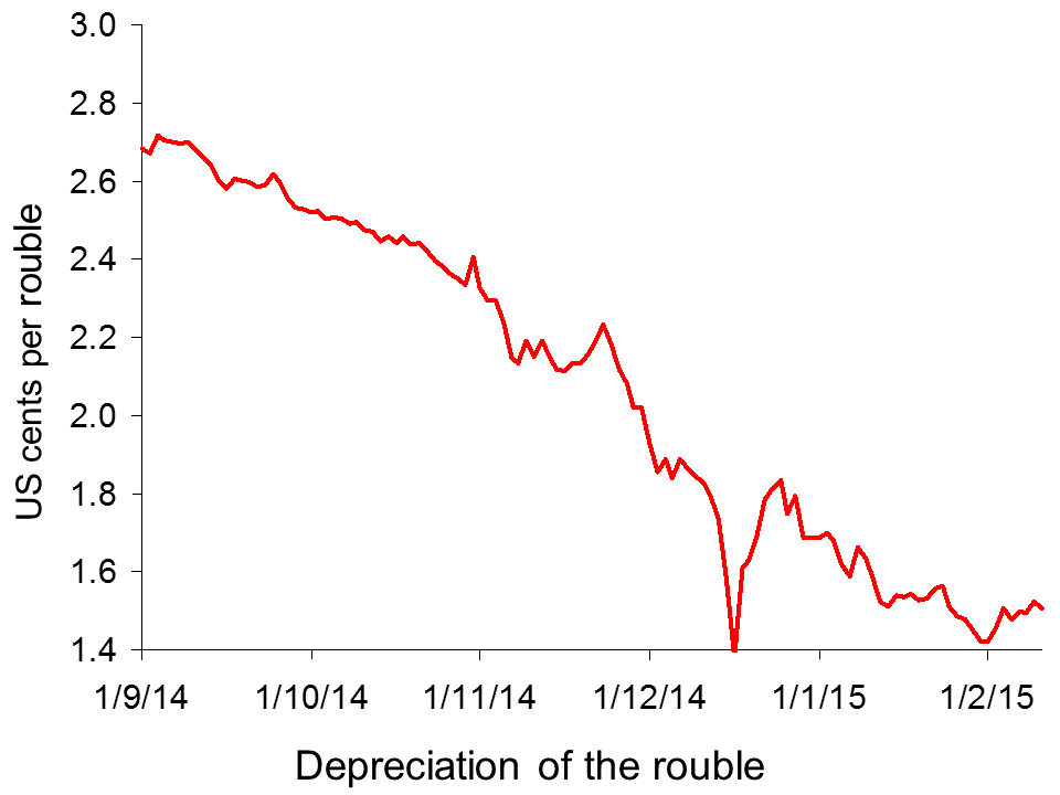 Russia has been adversely affected and estimates suggest that the economy will shrink further over the coming year. Oil and gas prices have declined significantly and while this is good news for many consumers across the world, it brings much sadder tidings for an economy, such as Russia, that is so dependent on oil exports.
However, is there a bright side to the sanctions or the falling currency? The BBC News article considers the winners and losers in Russia, including families struggling to feed their families following spending cuts and businesses benefiting from less competition.
 Russia’s economic turmoil: nightmare or opportunity? BBC News, Olga Ivshina and Oleg Bodyrev (5/2/15)
Questions
- Why has the rouble fallen in value? Use a demand and supply diagram to illustrate this.
- What does a cheap rouble mean for exporters and importers within Russia and within countries such as the UK or US?
- One of the businesses described in the article explain how the sanctions have helped. What is the explanation and can the effects be seen as being in the consumer’s interest?
- Oil prices have fallen significantly over the past few months. Why is this so detrimental to Russia?
- What is the link between the exchange rate and inflation?
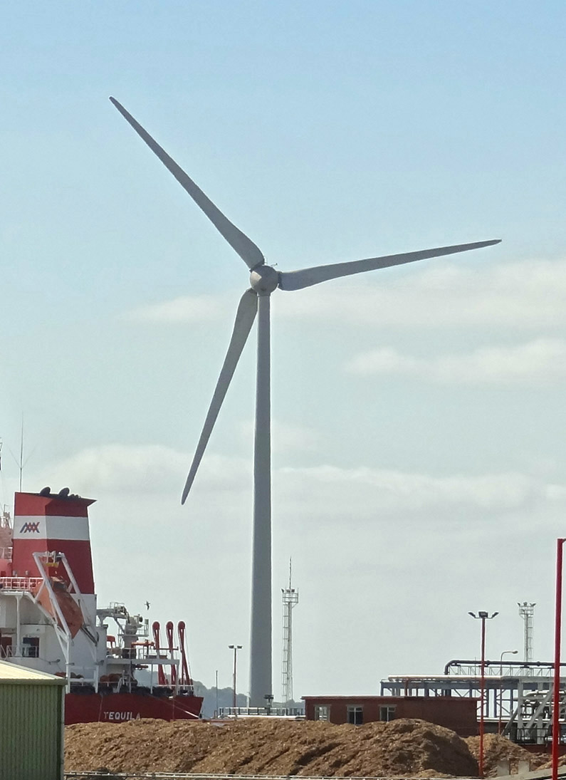
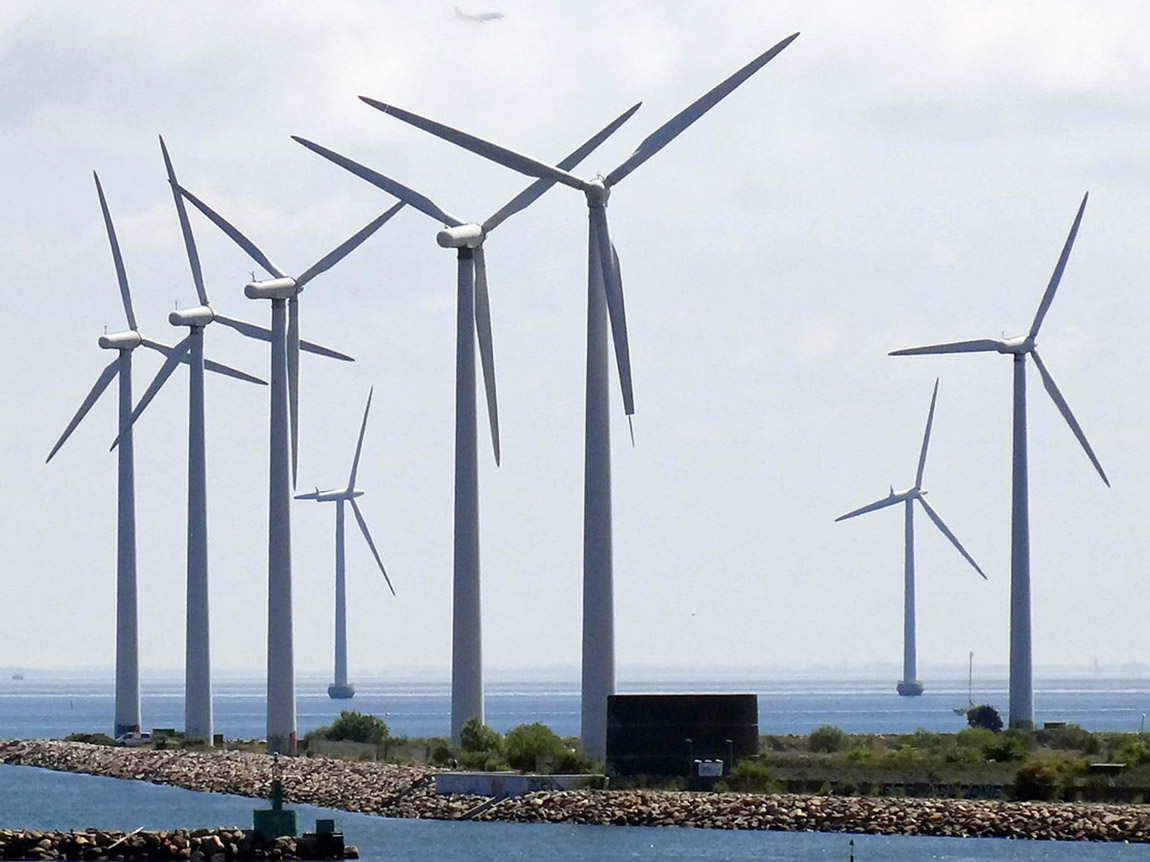
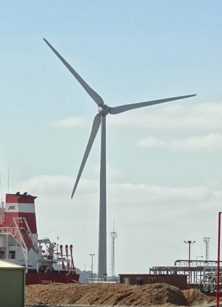 When an industry produces positive externalities, there is an argument for granting subsidies. To achieve the socially efficient output in an otherwise competitive market, the marginal subsidy should be equal to the marginal externality. This is the main argument for subsidising wind power. It helps in the switch to renewable energy away from fossil fuels. There is also the secondary argument that subsidies help encourage the development of technologies that would be too uncertain to fund at market rates.
If subsidies are to be granted, it is important that they are carefully designed. Not only does their rate need to reflect the size of the positive externalities, but also they should not entail any perverse incentive effects. But this is the claim about subsidies given to wind turbines: that they create an undesirable side effect.
Small-scale operators are encouraged to build small turbines by offering them a higher subsidy per kilowatt generated (through higher ‘feed-in’ tariffs). But according to a report by the Institute for Public Policy Research (IPPR), this is encouraging builders and operators of large turbines to ‘derate’ them. This involves operating them below capacity in order to get the higher tariff. As the IPPR overview states:
The scheme is designed to support small-scale providers, but the practice of under-reporting or ‘derating’ turbines’ generating capacity to earn a higher subsidy is costing the taxpayer dearly and undermining the competitiveness of Britain’s clean energy sector.
The loophole sees developers installing ‘derated’ turbines – that is, turbines which are ‘capped’ so that they generate less energy. Turbines are derated in this way so that developers and investors are able to qualify for the more generous subsidy offered to lower-capacity turbines, generating 100–500kW. 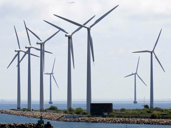 By installing derated turbines, developers are making larger profits off a feature of the scheme that was designed to support small-scale projects. Currently, the rating of a turbine is declared by the manufacturer and installer, resulting in a lack of external scrutiny of the system.
The subsidies are funded by consumers through higher electricity prices. As much as £400 million could be paid in excess subsidies. The lack of scrutiny means that operators could be receiving as much as £100 000 per year per turbine in excess subsidies.
However, as the articles below make clear, the facts are disputed by the wind industry body, RenewableUK. Nevertheless, the report is likely to stimulate debate and hopefully a closing of the loophole.
Video
Turbine power: the cost of wind power to taxpayers Channel 4 News, Tom Clarke (10/2/15)
Articles
Wind subsidy loophole boosts spread of bigger turbines Financial Times, Pilita Clark (10/2/15)
Call to Close Wind Power ‘Loophole’ Herald Scotland, Emily Beament (10/2/15)
Wind farm developers hit back at ‘excessive subsidy’ claims Business Green, Will Nichols (10/2/15)
The £400million feed-in frenzy: Green energy firms accused of making wind turbines LESS efficient so they appear weak enough to win small business fund Mail Online, Ben Spencer (10/2/15)
Wind power subsidy ‘loophole’ identified by new report Engineering Technology Magazine, Jonathan Wilson (11/2/15)
Report
Feed-in Frenzy Institute for Public Policy Research, Joss Garman and Charles Ogilvie (February 2015)
Questions
- Draw a diagram to demonstrate the optimum marginal rate of a subsidy and the effect of the subsidy on output.
- Who should pay for subsidies: consumers, the government (i.e. taxpayers generally), electricity companies through taxes on profits made from electricity generation using fossil fuels, some other source? Explain your thinking.
- What is the argument for giving a higher subsidy to operators of small wind turbines?
- If wind power is to be subsidised, is it better to subsidise each unit of output of electricity, or the construction of wind turbines or both? Explain.
- What could Ofgem do (or the government require Ofgem to do) to improve the regulation of the wind turbine industry?
 Economics is about choices. But how can people be persuaded to make healthy choices, or socially responsible or environmentally friendly choices? Behavioural economists have studied how people can be ‘nudged’ into changing their behaviour. One version of nudge theory is ‘fun theory’. This studies how people can be persuaded into doing desirable things by making it fun to do so.
I came across the first video below a couple of days ago. It looks at a highly successful experiment at the Odenplan underground station in Stockholm to persuade people to make the healthy choice of using the stairs rather than the escalator. It made doing so fun. The stairs were turned into a musical keyboard, complete with sound. Each stair plays a piano note corresponding to its piano key each time someone treads on it. As you go up the stairs you play an ascending scale.
After installing the musical staircase, 66% more people than normal chose the stairs over the escalator.
 The fun theory initiative is sponsored by Volkswagen. The Fun Theory website is ‘dedicated to the thought that something as simple as fun is the easiest way to change people’s behaviour for the better. Be it for yourself, for the environment, or for something entirely different, the only thing that matters is that it’s change for the better.’
VW held a competition in 2009 to encourage people to invent fun products designed to change people’s behaviour. There were over 700 entries and you can see them listed on the site. The 13 finalists included the musical staircase, traffic lights with quiz questions on the red, a Connect Four beer crate, fun tram tickets (giving entry to an instant-win lottery), a pinball exercise machine, a speed camera lottery where a winner is chosen from those abiding by the speed limit, a jukebox rubbish bin (which plays when people add rubbish), a one-armed vending machine, a fun doormat, car safety belts linked to a car’s entertainment system, car safety belt with a gaming screen which turns on when buckled, a bottle bank arcade system and the world’s deepest bin (or at least one which sounds as if it is). The winner was the speed camera lottery.
The fun theory site
Thefuntheory.com
Fun theory videos
Piano Staircase – Odenplan, Stockholm (on Vimeo)
The Speed Camera Lottery (on VIMP.com, Kevin Richardson)
Garbage Jukebox (on YouTube)
The World’s Deepest Bin (on Vimeo)
Bottle Bank Arcade (on YouTube)
Questions
- Does fun theory rely on rational choices?
- Other than through having fun, how else may people be nudged into changing their behaviour?
- Go through some of the entries to the Fun Theory Award and choose three that you particularly like. Explain why.
- Invent your own fun theory product. You might do this by discussing it groups and perhaps having a group competition.
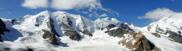
The World Economic Forum has been holding its annual meeting in the up-market Swiss ski resort of Davos. Many of the world’s richest and most powerful people attend these meetings, including political leaders, business leaders and representatives of various interest groups.
This year, one of the major topics has been the growth in inequality across the globe and how to reverse it. According to a report by Oxfam, Wealth: Having it all and wanting more:
The richest 1 per cent have seen their share of global wealth increase from 44 per cent in 2009 to 48 per cent in 2014 and at this rate will be more than 50 per cent in 2016. Members of this global elite had an average wealth of $2.7m per adult in 2014.
Of the remaining 52 per cent of global wealth, almost all (46 per cent) is owned by the rest of the richest fifth of the world’s population. The other 80 per cent share just 5.5 per cent and had an average wealth of $3851 per adult – that’s 1/700th of the average wealth of the 1 per cent.
Currently, the richest 85 people in the world have the same amount of wealth as the poorest 50% of the world’s population. It might seem odd that those with the wealth are talking about the problem of inequality.  Indeed, some of those 85 richest people were at the conference: a conference that boasts extremely luxurious conditions. What is more, many delegates flew into the conference in private jets (at least 850 jets) to discuss not just poverty but also climate change!
Yet if the problem of global inequality is to be tackled, much of the power to do so lies in the hands of these rich and powerful people. They are largely the ones who will have to implement policies that will help to raise living standards of the poor.
But why should they want to? Part of the reason is a genuine concern to address the issues of increasingly divided societies. But part is the growing evidence that greater inequality reduces economic growth by reducing the development of skills of the lower income groups and reducing social mobility. We discussed this topic in the blog, Inequality and economic growth.
So what policies could be adopted to tackle the problem. Oxfam identifies a seven-point plan:
|
|
| • |
Clamp down on tax dodging by corporations and rich individuals; |
| • |
Invest in universal, free public services such as health and education; |
| • |
Share the tax burden fairly, shifting taxation from labour and consumption towards capital and wealth; |
| • |
Introduce minimum wages and move towards a living wage for all workers; |
| • |
Ensure adequate safety-nets for the poorest, including a minimum income guarantee; |
| • |
Introduce equal pay legislation and promote economic policies to give women a fair deal; |
| • |
Agree a global goal to tackle inequality. |
But how realistic are these policies? Is it really in the interests of governments to reduce inequality? Indeed, some of the policies that have been adopted since 2008, such as bailing out the banks and quantitative easing, have had the effect of worsening inequality. QE drives up asset prices, particularly bond, share and property prices. This has provided a windfall to the rich: the more of such assets you own, the greater the absolute gain.
The following videos and articles look at the problem of growing inequality and how realistic it is to expect leaders to do anything significant about it.
Videos and podcasts
Income inequality is ‘brake on growth’, Oxfam chief warns Davos France 24, Winnie Byanyima (22/1/15)
Davos dilemma: Can the 1% cure income inequality? Yahoo Finance, Lizzie O’Leary and Shawna Ohm (21/1/15)
Richest 1% ‘Will Own Half The World’s Wealth By 2016’ ITN on YouTube, Sarah Kerr (19/1/15)
The Price of Inequality BBC Radio 4, Robert Peston (3/2/15 and 10/2/15)
Articles
Richest 1% will own more than all the rest by 2016 Oxfam blogs, Jon Slater (19/1/15)
Global tax system can cut inequality The Scotsman, Jamie Livingstone (23/1/15)
A new framework for a new age Financial Times, Tony Elumelu (23/1/15)
The global elite in Davos must give the world a pay rise New Statesman, Frances O’Grady (22/1/15)
New Oxfam report says half of global wealth held by the 1% The Guardian, Larry Elliott and Ed Pilkington (19/1/15)
Davos is starting to get it – inequality is the root cause of stagnation The Guardian, Larry Elliott (25/1/15)
Inequality isn’t inevitable, it’s engineered. That’s how the 1% have taken over The Guardian, Suzanne Moore (19/1/15)
Why extreme inequality hurts the rich BBC News, Robert Peston (19/1/15)
Eurozone stimulus ‘reinforces inequality’, warns Soros BBC News, Joe Miller (22/1/15)
Hot topic for the 1 percent at Davos: Inequality CNBC, Lawrence Delevingne (21/1/15)
Global inequality: The wrong yardstick The Economist (24/1/15)
A Richer World (a compendium of articles) BBC News (27/1/15)
Data
OECD Income Distribution Database: Gini, poverty, income, Methods and Concepts OECD
The effects of taxes and benefits on household income ONS
Questions
- Why has inequality increased in most countries in recent years?
- For what reasons might it be difficult to measure the distribution of wealth?
- Which gives a better indication of differences in living standards: the distribution of wealth or the distribution of income?
- Discuss the benefits and costs of using the tax system to redistribute (a) income and (b) wealth from rich to poor
- Go through each of the seven policies advocated by Oxfam and consider how practical they are and what possible objections to them might be raised by political leaders.
- Why is tax avoidance/tax evasion by multinational companies difficult to tackle?
- Does universal access to education provide the key to reducing income inequality within and between countries?
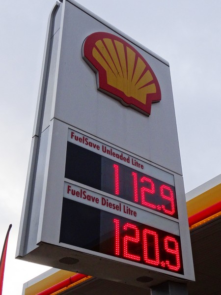 Oil prices have been plummeting in recent months. Indeed, many commentators are saying that this is the major economics news story of 2014. In June 2014 Brent crude was around $112 per barrel. By December the price has fallen to around $60 – a fall of 46%. But what are the implications for fuel prices?
Just because the crude oil price has fallen by 46%, this does not mean that prices at the pump should do the same. Oil is priced in dollars and the pound has depreciated against the dollar by just over 7% since June, from around £1 = $1.69 to around £1 = $1.57. Thus in sterling terms, crude oil has fallen by only 42%.
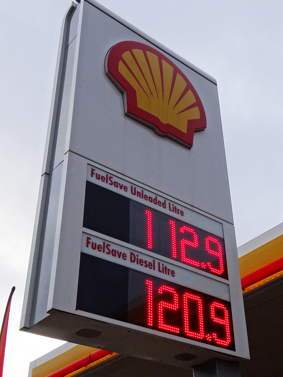
More significantly, the cost of crude is a relatively small percentage of the price of a litre of petrol. At a price of 132p per litre (the July average price), crude accounted for around 27% of the price, or around 36p per litre. At a price of 114p per litre, the price in late December, crude accounts for around 19% of the price, or around 21.5p per litre. The largest element of price is fuel duty, which is charged at a flat rate of 57.95p per litre. In addition there is VAT at 20% of the pre-VAT price (or 16.67% of the retail price). Finally there are the refining, distribution and retail costs and margins, but these together account for only around 16p per litre.
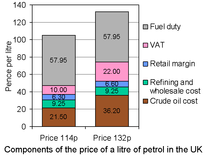 What this means is that the 46% cut in oil prices has led to a cut in petrol prices of only around 14%. If petrol prices were to reach £1 per litre, as some commentators have forecast, crude oil prices would have to fall to under $40 per barrel.
Although petrol and diesel prices have fallen by a smaller percentage than oil prices, this still represents a significant cut in motoring and transport costs. It also represents a significant cut in costs for the petrochemical industry and other industries using large amounts of oil.
For oil-importing countries this is good news as the fall in the oil price represents an increase in real incomes. For oil importing countries, and especially those such as Russia and some OPEC countries where oil constitutes a large proportion of their exports, it is bad news. We explore these effects in Part 2.
Videos
UK petrol prices hit four-year low BBC News, John Moyland (10/12/14)
Petrol prices plunge ahead of Christmas holidays Belfast Telegraph (19/12/14)
Petrol price plummet – could fuel drop to below a pound a litre in the New Year? Channel 5 News on YouTube (17/12/14)
Articles
UK motorists benefit from petrol price drop Financial Times, Michael Kavanagh (23/12/14)
Petrol to drop to £1 a litre, says Goldman Sachs The Telegraph, Szu Ping Chan (9/12/14)
Oil prices: How low will they go in 2015? International Business Times, Shane Croucher (22/12/14)
Plummeting oil price may lead to petrol falling below £1 a litre RAC news (17/12/14)
Pump Prices: Cheap Petrol Comes With A Warning Sky News (19/12/14)
Data and information
Fuel prices in Europe Drive Alive (20/12/14)
Weekly road fuel prices Department of Energy & Climate Change (23/12/14)
Prices at the pump – why are they falling and will this continue? ONS (18/12/14)
Fuel Prices Explained RAC
UKPIA Statistical Review 2014 United Kingdom Petroleum Industry Association
Questions
- Why does the price of petrol fluctuate less in percentage terms than the price of crude oil?
- What factors will affect whether UK petrol prices fall to £1 per litre?
- If crude oil prices fell by 20%, in which of these two cases would there be a bigger percentage fall in petrol prices: (a) petrol price currently 140p; (b) petrol price currently 110p? Explain.
- Distinguish between a specific tax and an ad valorem tax. Which of these is (a) fuel duty; (b) VAT? Illustrate your answer with a supply and demand diagram.
- What determines the price elasticity of demand for petrol and diesel? Is the long-run elasticity likely to be higher or lower than the short-run elasticity? Explain.
- Distinguish between demand-pull and cost-push inflation. Given that oil price changes are correlated to inflation, would you characterise recent falls in inflation as reductions in demand-pull or cost-push pressures, or both: (a) in a specific oil-importing country; (b) globally?
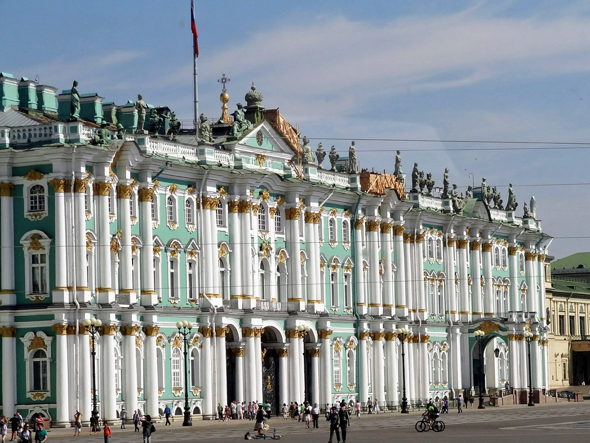 Many important economic changes have occurred over the past two years and many have occurred in the past two months. Almost all economic events create winners and losers and that is no different for the Russian economy and the Russian population.