We know two things about economic growth in a developed economy like the UK: it is positive over the longer term, but highly volatile in the short term. We can refer to these two facts as the twin characteristics of growth. The volatility of growth sees occasional recessions, i.e. two or more consecutive quarters of declining output. Since 1973, the UK has experienced six recessions.
Here we consider in a little more detail the growth numbers for the UK from the latest Quarterly National Accounts, focusing on the depth and duration of these six recessions. How do they compare?
The latest figures on British economic growth show that the UK economy grew by 0.9 per cent in the third quarter of 2012. However, when compared with the third quarter of 2011, output was essentially unchanged. This means that the annual rate of growth was zero. Perhaps even more telling is that output (real GDP) in Q3 2012 was still 3.0 per cent below its Q1 2008 level.
The chart helps to put the recent output numbers into an historical context. It shows both the quarter-to-quarter changes in real GDP (right-hand axis) and the level of output as measured by GDP at constant 2009 prices (left-hand axis). It captures nicely the twin characteristics of growth. Since 1970, the average rate of growth each quarter has been 0.6 per cent. This is equivalent to an average rate of growth of 2.35 per cent per year. The chart also allows us to pin-point periods of recessions.
One way of comparing recessions is to compare their ‘2 Ds’: depth and duration. The table shows the number of quarters each of the six recessions since 1973 lasted. It also shows how much smaller the economy was by the end of each recession. In other words, it shows the depth of each recession as measured by the percentage reduction in output (real GDP).
British recessions
Duration (quarters)
Depth (output lost, %)
1973Q3–74Q1
3
3.25
1975Q2–75Q3
2
1.76
1980Q1–81Q1
5
4.63
1990Q3–91Q3
5
2.93
2008Q2–09Q2
5
6.28
2011Q4–12Q2
3
0.90
We can see that three of the recessions lasted for five quarters. In the case of the recessions starting in 1975 and 2011 they occurred very shortly after a previous recession. Hence, we observe two so-called double-dip recessions.
The table reveals that the deepest recession by some distance was that in the late 2000s. As a result of this recession, UK output declined by 6.3 per cent. As the recent GDP numbers show, the UK has yet to recover the ‘lost output’ that followed the financial crisis.
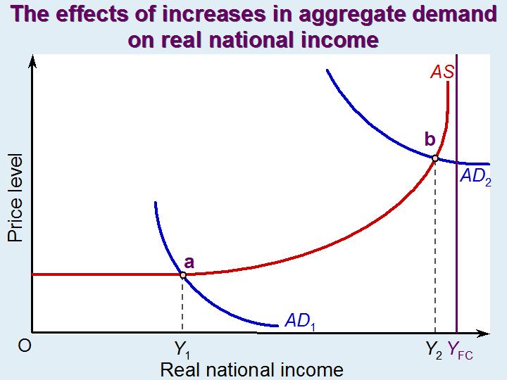
If aggregate demand were to expand, would there be sufficient spare capacity to allow aggregate supply to expand to meet the additional demand? This is the question addressed by the podcast and article below.
If there is plenty of spare capacity, policies to increase aggregate demand could help to take up the slack and thereby achieve economic growth – at least as long as spare capacity remains. In other words, in the short run the aggregate supply curve may be horizontal or only gently upward sloping at the current point of intersection with the aggregate demand curve. This is illustrated by point a in the diagram. A rightward shift in the aggregate demand curve would cause a movement along the aggregate supply curve to a new higher level of real national income (Y).
If, however, there is little or no spare capacity, an increase in nominal aggregate demand is likely to be purely inflationary, or virtually so. This would the case at point b in the diagram. Real national income cannot expand beyond the full-capacity level, YFC. Under such circumstances, any attempt by the government to stimulate economic growth should focus on the supply side and attempt to shift the aggregate supply curve to the right. Examples of supply-side policy include incentives to encourage research and development, incentives for the private sector to invest in new capacity and direct public investment in infrastructure.
Unemployment is not just caused by a lack of aggregate demand relative to aggregate supply. It may be the result of a mismatching of labour supply with the demand for labour. People may have the wrong qualifications or not be where the jobs are. Unemployment may co-exist with quite high levels of vacancies. There may be vacancies for highly qualified scientists, technicians or craftspeople and unemployment of people with low skills or skills no longer in high demand. The same may apply to capital equipment. There may be a shortage of high-tech equipment or equipment to produce goods in high demand and redundant older equipment or equipment in areas of declining demand.
Part of a comprehensive set of policies to tackle unemployment and achieve economic growth would be to focus on the whole balance of the economy and the matching of the demand and supply of inputs.
In a previous blog, Anyone got a crystal ball?, we reported on the Bank of England’s and other agencies’ difficulty in making forecasts. As the Governor, Mervyn King, said, “There is just enormous uncertainty out there.”
The Bank of England has just published its November Inflation Report. This quarterly publication gives forecasts of inflation, GDP and other indicators. It is clear that forecasting hasn’t become any easier. In his opening remarks, Dr. King says:
Continuing the recent zig-zag pattern, output growth is likely to fall back sharply in Q4 as the boost from the Olympics in the summer is reversed – indeed output may shrink a little this quarter. It is difficult to discern the underlying picture. It is probably neither as good as the zigs suggest nor as bad as the zags imply.
The Inflation Report looks at the various factors affecting aggregate demand, inflation, unemployment and aggregate supply. It is quite clear on reading the report why there is so much uncertainty.
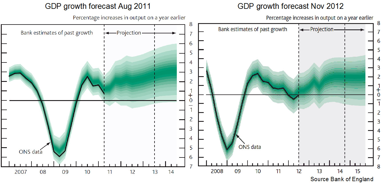
A salutary lesson is to look back at previous forecasts and see just how wrong they have been. The chart above shows the forecasts for GDP made in the Inflation Reports of Nov 2012 and Aug 2011. You can see that they are significantly different and yet just 15 months apart. You might also like to compare the forecasts made a year ago (or even two!) about 2012 with the actual situation today. A good source for this is the Treasury’s Forecasts for the UK economy. This collates the forecasts from a range of independent forecasters.
The inaccuracy of forecasting is an inevitable consequence of a highly interdependent world economy that is subject to a range of economic shocks and where confidence (or lack of it) is a major determinant of aggregate demand. But when firms, governments, individuals and central banks have to make plans, it is still necessary to project into the future and try to forecast as accurately as possible – even though it might mean keeping your fingers firmly crossed.
What was being forecast for economic growth and inflation for 2012 (a) one year ago; (b) two years ago?
What are the main reasons for the inaccuracy of forecasts?
How might forecasting be made more reliable?
If sentiment is a key determinant of economic activity, how might politicians increase the confidence of firms and consumers? What are the political constraints on doing this?
Explain the following statement from the Guardian article: “The problem … is that last decade’s tailwind has become this decade’s headwind.” Why is it difficult to forecast the strength of this ‘headwind’?
How useful is it to use past trends as a guide to the future course of the economy?
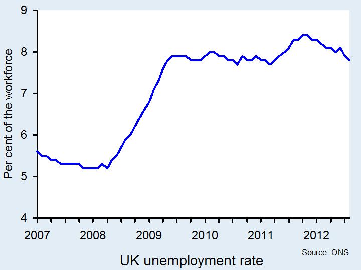
UK Unemployment figures for the July to September period have just been published. Perhaps surprisingly, the rate has fallen to 7.8% from 8.0% in the previous 3-month period. What is more, there have been similar 0.2 percentage-point falls in each of the two 3-month periods prior to that (see chart below).
This would normally suggest that the economy has been growing strongly and faster than the growth in potential output. But, despite positive economic growth in quarter 3 (see A positive turn of events?), the economy has been experiencing a prolonged period of low or negative growth.
So what is the explanation for the fall in unemployment? (For a PowerPoint of the chart, click here)
One reason is a greater flexibility in the labour market than in previous recessions. People are more willing to accept below inflation wage increases, or even nominal wage cuts, in return for greater job security. Others are prepared to reduce their hours.
The other reason is a fall in productivity (i.e. output per hour worked). One explanation is that people are not working so hard because, with a lack of demand, there is less pressure on them to be productive; a similar explanation is that firms are ‘hoarding’ labour in the hope that the market will pick up again.
Another explanation is that employment growth has often occurred in the low productivity industries, such as labour-intensive service industries; another is that when people leave their jobs they are replace by less productive workers on lower wages; another is that workers are making do with ageing equipment, whose productivity is falling, because firms cannot afford to invest in new equipment. An range of possible explanations is given on page 33 of the Bank of England’s November 2012 Inflation Report.
But with many predicting that growth will be negative again in 2012 quarter 4, the fall in unemployment may not continue. Britain may join many other countries in Europe and experience rising unemployment as well as falling output.
What possible explanation are there for the latest fall in unemployment?
What has been happening to employment, both full time and part time?
What are the different ways of measuring productivity? Why will they be affected differently by a fall in the average number of hours worked?
Why might it be in firms’ interests to maintain the level of their workforce despite falling sales?
Assume that there has been a fall in aggregate demand. Compare the resulting effect on consumption of (a) a fall in wages rates; (b) a rise in unemployment. How might the design of the benefit system affect the answer?
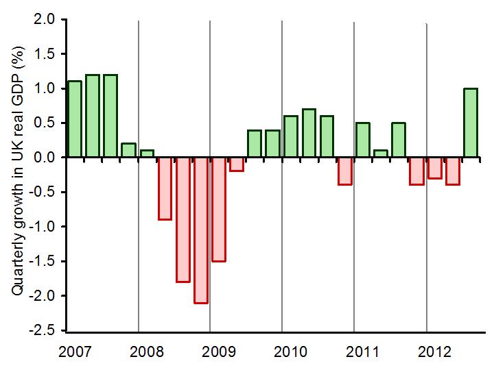
The story of the UK economy over the past few years has been one of bad news and worse news. With a double-dip recession having kept confidence low in the UK, positive news for the economy was seemingly a distant hope of government ministers. However, official statistics show that that in the 3 months from July to September, the UK economy emerged from recession, with growth of 1.0%.
This positive GDP figure (click here for a PowerPoint of the chart below) was undoubtedly helped by the London Olympics over the summer, which may have added as much as 0.2 percentage points to GDP, according to the ONS. Millions arriving in London and other venues, spending money on countless things. Yet, other factors have also contributed to this welcome growth. Stephanie Flanders said:
The positive ‘surprise’ in these figures is largely to be found in the service sector, which is estimated to have growth by 1.3% in the third quarter, after shrinking by 0.1% in the three months before.
Further to this, in Stephanie Flanders’ ‘Stephanomics’, she says that ‘it confirms that the last three months of this latest recession were brought to you by the Queen. Or at least, the extra Bank Holiday to celebrate her Jubilee.’ The Bank of England suggests that the Jubilee took 0.5 percentage points from official GDP statistics. So, the news so far is positive, but the economy is far from being back to its pre-recession size.
The 2008-2009 recession knocked 6.4% off the UK economy. Since then, the total growth (over the past 4 years) has reached only half of that – 3.2% and that includes the 1% figure just published. Thus, while we may be on ‘the right track’, there is still a long way to go. Economists differ in their interpretations of what this means for the overall recovery: some say that this is a sign of what’s to come; others argue that this recovery has been driven by one-off factors.
What is certain is that government policy over the next few months will be crucial in keeping the economy on the right growth path. The following articles consider the implications of this new economic data.
Which factors have contributed towards lower GDP data towards the beginning of this year?
Which factors have helped boost GDP in the 3 months from July to September?
Why is there disagreement about the likelihood of positive GDP figures continuing throughout the rest of the year?
Prior to the official release of the GDP figures, David Cameron hinted at positive news. Given that the market is so sensitive, what effect might this suggestion have had?
Given this positive figure, what implications does this have for the government’s quantitative easing programme?
If we translate this latest growth data onto an AD/AS diagram, how would you show what has recently happened?
 We know two things about economic growth in a developed economy like the UK: it is positive over the longer term, but highly volatile in the short term. We can refer to these two facts as the twin characteristics of growth. The volatility of growth sees occasional recessions, i.e. two or more consecutive quarters of declining output. Since 1973, the UK has experienced six recessions.
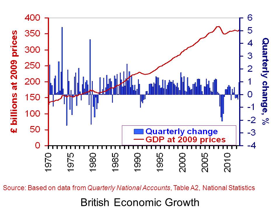 The chart helps to put the recent output numbers into an historical context. It shows both the quarter-to-quarter changes in real GDP (right-hand axis) and the level of output as measured by GDP at constant 2009 prices (left-hand axis). It captures nicely the twin characteristics of growth. Since 1970, the average rate of growth each quarter has been 0.6 per cent. This is equivalent to an average rate of growth of 2.35 per cent per year. The chart also allows us to pin-point periods of recessions.