Consumer spending is crucial to an economy. In the UK total consumer spending is equivalent to almost two-thirds of the value of country’s GDP. Understanding its determinants is therefore crucial in attempting to forecast the short-term path of the economy. In other words, the growth of the economy in 2013 will depend on our inclination to spend.
While the amount of disposable income (post-tax income) will be one factor influencing our spending, other factors matter too. Amongst these ‘other factors’ is the stock of wealth of households. Here we look at the latest available figures on the net worth of the UK household sector. Will our stock of wealth help to underpin spending or will it act to constrain spending?
The household sector’s net worth is the sum of its net financial wealth and non-financial (physical) wealth. Net financial wealth is the balance of financial assets over financial liabilities. Financial assets include funds in savings accounts, shares and pension funds. Financial liabilities include debts secured against property, largely residential mortgages, and unsecured debts, such as overdrafts and unpaid balances on credit cards. Non-financial wealth largely includes the value of the sector’s holdings of property and buildings.
The following table summarises the net worth of the UK household sector at the end of 2011 and 2010. The figures are taken from the Office for National Statistics release, National Balance Sheet. They show that at the end of 2011, the household sector had a net worth of £7.04 trillion. This was up just 0.1 per cent up 2010. At the end of 2011, the stock of net worth of the household sector was 7 times the amount of disposable income earned by the sector in 2011.
We can also see from the table the significance of the value of non-financial assets to net worth. The value of households’ physical wealth is slightly larger than the value of its financial assets, though in 2011 both equate to around 4¼ times the annual flow of disposable income.
2011 saw the value of the stock of non-financial wealth grow by 0.7 per cent while the value of the sector’s stock of financial assets fell by 0.4 per cent. Meanwhile, the value of the stock of financial liabilities was virtually unchanged at a little over £1½ trillion. In 2011, the sector’s financial liabilities were equivalent to around 1½ times its annual disposable income. While this is down from the 2007 peak of 1¾ times income, it is considerably higher than during the period from 1987 to 1999 when the financial liabilities to income ratio remained consistently close to 1. The 2000s saw a rapid expansion of the sector’s liabilities relative to its income and, hence, today there remains what economists call a debt overhang.
Despite the very small overall increase in net worth in 2011, the stock of net wealth was up by 18 per cent on 2008. During 2008, net worth fell by 12 per cent. This was on the back of a fall in non-financial wealth of 9.4 per cent, a fall in the value of financial assets of 10.1 per cent and an increase in the value of financial liabilities of 1.9 per cent.
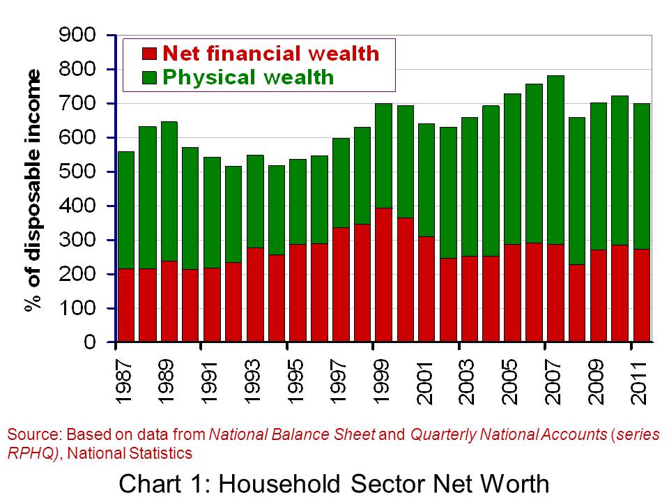
Chart 1 gives an historical picture of net worth. It shows the two principal balances that comprise net worth: net financial wealth and physical wealth. Each is shown relative to annual disposable income. Again, we can see the importance of physical wealth to overall net worth. The growth in house prices from the late 1990s through to the economic downturn of the late 2000s helps to explain its rising relative importance in net worth. We can also see from the chart that the relative level of net worth is roughly on a par with its value at the end of the 1990s. However, the composition is different. Today, relatively more of the sector’s net worth comes from non-financial wealth compared with that from net financial wealth.
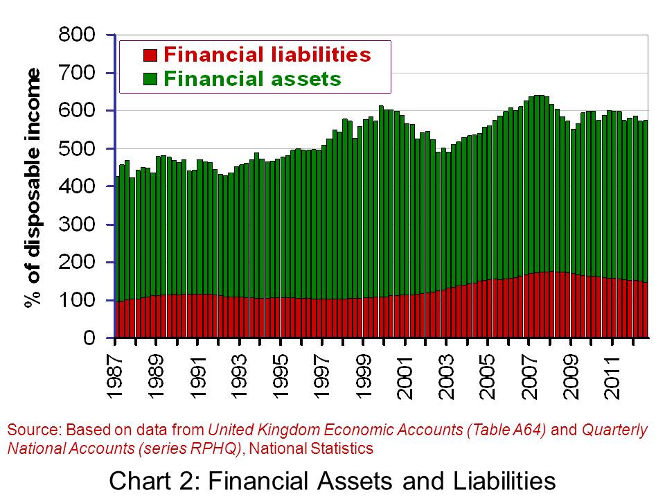
A crucial question for spending in the months ahead is how inclined the household sector feels to consolidate its balance sheets further. Chart 2 includes more recently available data on financial assets and liabilities from United Kingdom Economic Accounts, Q3 2012. From it we can see the declining stock of financial liabilities relative to disposable income. This has been driven by an actual fall in the stock of unsecured financial liabilities. In the 12-month period up to the end of Q3 2012, the stock of unsecured financial liabilities fell by 6.4 per cent (the stock of secured debt rose by 1.8 per cent). This consolidation of unsecured debt suggests that households remain understandably cautious given the uncertain economic environment. Hence, the household balance sheet will most probably continue to constrain consumption growth in the short-term.
Are the components of the balance sheet stocks or flows. Explain your answer. What about disposable income?
List those factors that might affect the value of each component of the household balance sheet.
Again considering the balance sheet, try drawing up a list of ways in which the components of the balance sheet could affect spending.
What do you think has been the motivating factor behind the declining stock of unsecured financial liabilities? What impact is this likely to have on consumer spending?
If the real value of disposable income increases in 2013 shouldn’t this be enough to see real value of consumption increase?
How would the balance sheet of a household that rents differ from a household that is an owner-occupier?
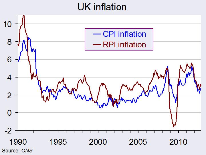
Inflation is a key macroeconomic variable and governments typically aim for both low and stable rates of inflation. In the UK there are two main measures of the rate of inflation in the UK – the CPI and the RPI. Over the past few years there has been a growing gap between the two measures and this has led to consultations about how the RPI could be adapted to allow it to rise more slowly in the future. (Click here for a PowerPoint of the chart.)
The RPI and CPI measure inflation in different ways – they don’t measure the same basket of goods. The RPI measure includes the costs of housing, whereas the CPI does not include this. Furthermore, the RPI is an arithmetic mean and the CPI is a geometric mean, which will be lower than the arithmetic mean. The ONS says that a key advantage of using the geometric mean (i.e. the CPI) is that:
…it can better reflect changes in consumer spending patterns relative to changes in the price of goods and services.
Typically the RPI has been about 1% higher than the CPI and governments can benefit from this by linking state benefits to the CPI (the lower rate) and payments they receive to the RPI, thus maximising the difference between earnings and expenditure.
However, the gap between these two measures of inflation has been growing and this has been causing concern for the ONS and the Office for Budget Responsibility (OBR). This has led to the consultative process regarding making changes to the RPI. However, any change made to the RPI would put certain groups at a disadvantage. One such group is pensioners – many pensioners in the private sector have their pensions linked to the RPI and if a change were made to bring it more in line with the CPI (i.e. lower it) they would suffer. Ros Altman, director general of SAGA said:
After 30 years of retirement, someone who receives 0.6% lower inflation uprating will end up with a pension nearly 20% lower…Therefore, over time, pensioners will be able to afford less and less and pensioner poverty will increase once again.
There would be some beneficiaries of any change to the RPI – the government would benefit in some areas; company pension schemes might also see gains made; some students might benefit and even rail travellers.
An announcement was made by the National Statistician, Jil Matheson, on the 10 January. Much to the surprise of most experts, she has decided to keep the RPI measure unchanged. She did recommend, however, that a new index be introduced that would be published alongside RPI and CPI. The new index would better meet international standards.
The following articles look at the arguments for and against changing the RPI measure.
Pressure has been growing in the UK for people to be paid no less than a living wage. The Living Wage Foundation claims that this should be £8.55 per hour in London and £7.45 in the rest of the UK. The current minimum wage is £6.19.
There has been considerable support for a living wage across the political spectrum. Ed Miliband, the Labour leader, has stated that a Labour government would ensure that government employees were paid at least the living wage and that government contracts would go only to firms paying living wages. Other firms that paid less could be ‘named and shamed’. The living wage has also been supported by Boris Johnson, Conservative Mayor of London. The Prime Minister said that a living wage is ‘an idea whose time has come’, although many Conservatives oppose the idea.
The hourly living wage rate is calculated annually by the Centre for Research in Social Policy and is based on the basic cost of living. The London rate is calculated by the Greater London Authority.
Advocates of people being paid at least the living wage argue that not only would this help to reduce poverty, it would also help to reduce absenteeism and increase productivity by improving motivation and the quality of people’s work.
It would also bring in additional revenue to the government. According to a report by the Institute for Public Policy Research and the Resolution Foundation, if everyone were paid at least a living wage, this would increase the earnings of the low paid by some £6.5bn per year. Of this, some £3.6bn would go to the government in the form of higher income tax and national insurance payments and reduced spending on benefits and tax credits. Of this £6.5bn, an extra £1.3 billion would be paid to public-sector workers, leaving the Treasury with a net gain of £2.3bn.
But what would be the effect on employment? Would some firms be forced to reduce their workforce and by how much? Or would the boost to aggregate demand from extra consumer spending more than offset this and lead to a rise in employment?. The following articles look at the possible effects.
How would you set about determining what the living wage rate should be?
Distinguish between absolute and relative poverty. Would people being paid below a living wage be best described as absolute or relative poverty (or both or neither)?
What do you understand by the term ‘efficiency wage’? How is this concept relevant to the debate about the effects of firms paying a living wage?
Under what circumstances would raising the statutory minimum wage rate to the living wage rate result in increased unemployment? How is the wage elasticity of demand for labour relevant to your answer and how would this elasticity be affected by all firms having to pay at least the living wage rate?
What would be the macroeconomic effects of all workers being paid at least the living wage rate? What would determine the magnitude of these effects?
If aggregate demand were to expand, would there be sufficient spare capacity to allow aggregate supply to expand to meet the additional demand? This is the question addressed by the podcast and article below.
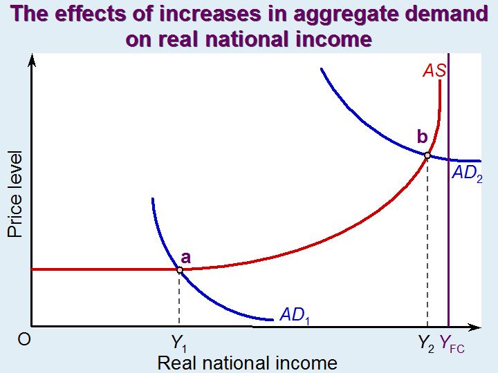
If there is plenty of spare capacity, policies to increase aggregate demand could help to take up the slack and thereby achieve economic growth – at least as long as spare capacity remains. In other words, in the short run the aggregate supply curve may be horizontal or only gently upward sloping at the current point of intersection with the aggregate demand curve. This is illustrated by point a in the diagram. A rightward shift in the aggregate demand curve would cause a movement along the aggregate supply curve to a new higher level of real national income (Y).
If, however, there is little or no spare capacity, an increase in nominal aggregate demand is likely to be purely inflationary, or virtually so. This would the case at point b in the diagram. Real national income cannot expand beyond the full-capacity level, YFC. Under such circumstances, any attempt by the government to stimulate economic growth should focus on the supply side and attempt to shift the aggregate supply curve to the right. Examples of supply-side policy include incentives to encourage research and development, incentives for the private sector to invest in new capacity and direct public investment in infrastructure.
Unemployment is not just caused by a lack of aggregate demand relative to aggregate supply. It may be the result of a mismatching of labour supply with the demand for labour. People may have the wrong qualifications or not be where the jobs are. Unemployment may co-exist with quite high levels of vacancies. There may be vacancies for highly qualified scientists, technicians or craftspeople and unemployment of people with low skills or skills no longer in high demand. The same may apply to capital equipment. There may be a shortage of high-tech equipment or equipment to produce goods in high demand and redundant older equipment or equipment in areas of declining demand.
Part of a comprehensive set of policies to tackle unemployment and achieve economic growth would be to focus on the whole balance of the economy and the matching of the demand and supply of inputs.
In a previous blog, Anyone got a crystal ball?, we reported on the Bank of England’s and other agencies’ difficulty in making forecasts. As the Governor, Mervyn King, said, “There is just enormous uncertainty out there.”
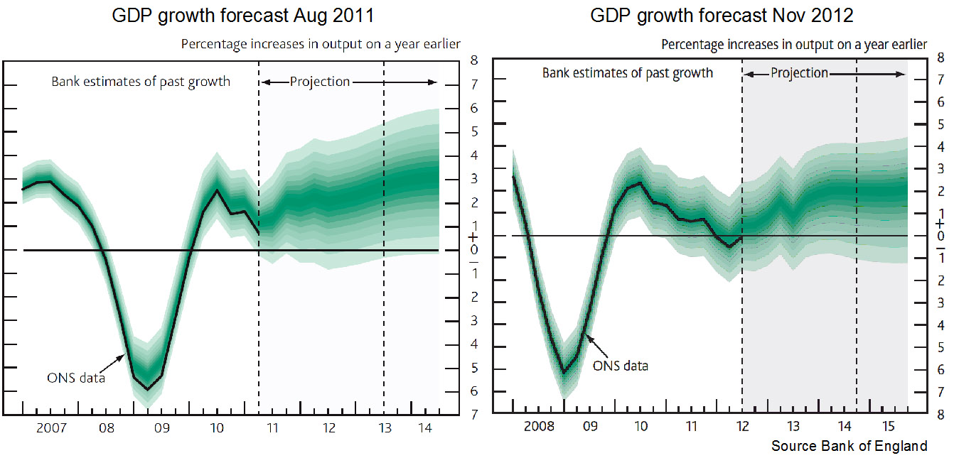
The Bank of England has just published its November Inflation Report. This quarterly publication gives forecasts of inflation, GDP and other indicators. It is clear that forecasting hasn’t become any easier. In his opening remarks, Dr. King says:
Continuing the recent zig-zag pattern, output growth is likely to fall back sharply in Q4 as the boost from the Olympics in the summer is reversed – indeed output may shrink a little this quarter. It is difficult to discern the underlying picture. It is probably neither as good as the zigs suggest nor as bad as the zags imply.
The Inflation Report looks at the various factors affecting aggregate demand, inflation, unemployment and aggregate supply. It is quite clear on reading the report why there is so much uncertainty.
A salutary lesson is to look back at previous forecasts and see just how wrong they have been. The chart above shows the forecasts for GDP made in the Inflation Reports of Nov 2012 and Aug 2011. You can see that they are significantly different and yet just 15 months apart. You might also like to compare the forecasts made a year ago (or even two!) about 2012 with the actual situation today. A good source for this is the Treasury’s Forecasts for the UK economy. This collates the forecasts from a range of independent forecasters.
The inaccuracy of forecasting is an inevitable consequence of a highly interdependent world economy that is subject to a range of economic shocks and where confidence (or lack of it) is a major determinant of aggregate demand. But when firms, governments, individuals and central banks have to make plans, it is still necessary to project into the future and try to forecast as accurately as possible – even though it might mean keeping your fingers firmly crossed.
What was being forecast for economic growth and inflation for 2012 (a) one year ago; (b) two years ago?
What are the main reasons for the inaccuracy of forecasts?
How might forecasting be made more reliable?
If sentiment is a key determinant of economic activity, how might politicians increase the confidence of firms and consumers? What are the political constraints on doing this?
Explain the following statement from the Guardian article: “The problem … is that last decade’s tailwind has become this decade’s headwind.” Why is it difficult to forecast the strength of this ‘headwind’?
How useful is it to use past trends as a guide to the future course of the economy?
 Consumer spending is crucial to an economy. In the UK total consumer spending is equivalent to almost two-thirds of the value of country’s GDP. Understanding its determinants is therefore crucial in attempting to forecast the short-term path of the economy. In other words, the growth of the economy in 2013 will depend on our inclination to spend.