 When you are next in town shopping, just keep in mind that consumer spending accounts for a little over 60 per cent of GDP. Therefore, consumption is incredibly important to the economy. How consumers behave is crucial to our short-term economic growth. The second estimate of British growth from the Office for National Statistics shows that the economy expanded by 0.3 per cent in the first three months of 2013. This follows a 0.3 per cent decline in the final quarter of 2012. Real household expenditure rose by just 0.1 per cent in Q1 2013. However, this was the sixth consecutive quarter in which the volume of purchases by households has grown.
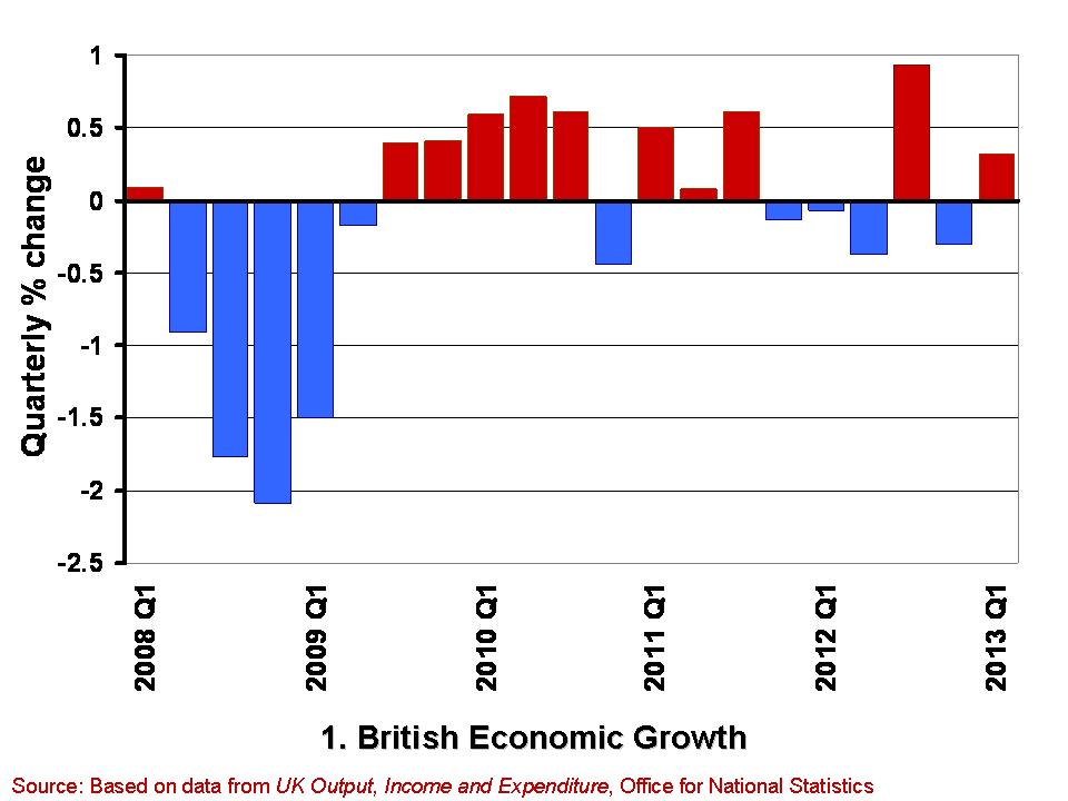 The growth in the economy is measured by changes in real GDP. Chart 1 shows the quarter-to-quarter change in real GDP since Q1 2008. (Click here to download a PowerPoint of the chart). During this period the economy is thought to have contracted in 10 of the 21 quarters shown. Furthermore, they show a double-dip recession and so two periods in close proximity where output shrank for two or more quarters. While more recent output numbers are frequently revised, which could see the double-dip recession possibly ‘statistically wiped’ from history, the period since 2008 will always been one characterised by anemic growth. The average quarterly growth rate since Q1 2008 has been -0.12 per cent.
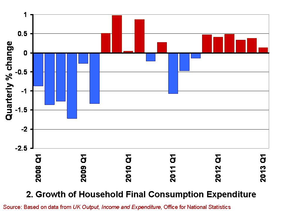 Chart 2 shows from Q1 2008 the quarterly growth in household expenditure in real terms, i.e. after stripping the effect of consumer price inflation. (Click here for a PowerPoint of the chart). Over the period, the volume of household consumption has typically fallen by 0.18 per cent per quarter. Hence, consumption has feared a little worse than the economy has a whole.
While the annualised rate of growth for the economy since Q1 2008 has averaged -0.47 per cent that for consumer spending has averaged -0.73 per cent. However, these figures disguise a recent improvement in consumer spending growth. This is because the volume of consumption has in fact grown in each of the six quarters since Q4 2011. In contrast, the economy has grown in only 2 of these quarters. It is, of course, much too early to start trumpeting consumption growth has heralding better times, not least because the 0.1 per cent growth in Q1 2013 is the weakest number since positive consumption growth resumed at the back end of 2011. Nonetheless, the figures do deserve some analysis by economists to understand what is going on.
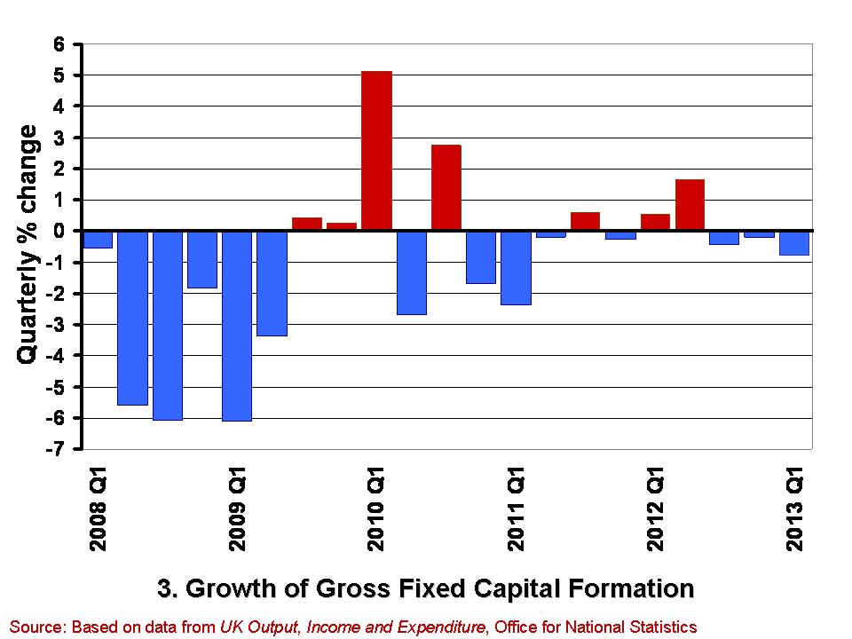 A slightly less promising note is struck by the gross fixed capital formation (GFCF) numbers. These numbers relate to the volume of investment in non-financial fixed assets, such as machinery, buildings, office space and fixtures and fittings. Chart 3 shows the quarterly growth in the volume of GFCF since Q1 2008. (Click here for a PowerPoint of the chart). The average quarterly rate of growth over this period has been -0.77 per cent. This is equivalent to an annual rate of decline of 3.9 per cent. GFCF has risen in only 7 of these quarters, declining in the remaining 14 quarters.
Worryingly, gross fixed capital formation has decreased in each of the last three quarters. While these figures may reflect continuing difficulties encountered by businesses in obtaining finance, they may also point to lingering concerns within the business community about the prospects for sustained growth. Therefore, it is important for economists to try and understand the drivers of these disappointing investment numbers and, hence, whether it is these or the slightly better consumption numbers that best hint at our short-term economic prospects.
Data
Second estimate of GDP, Q1 2013 Office for National Statistics
Second Estimate of GDP, Q1 2013 Dataset Office for National Statistics
Articles
UK GDP: concerns about underlying economy as 0.3pc growth confirmed Telegraph, Philip Aldrick (23/5/13)
UK investment fall among worst in G8 Guardian, Phillip Inman (23/5/13)
UK first-quarter growth unchanged BBC News (28/5/13)
U.K. Economy Grows 0.3% on Inventories, Consumer Spending Bloomberg, Svenja O’Donnell (23/5/13)
Surge in consumer spending kept UK out of recession The Telegraph (28/5/13)
Boost in service sector activity The Herald, Greig Cameron (28/5/13)
Hopes dashed as household spending rises by just 0.1% The Herald, Ian McConnell (24/5/13)
Questions
- Why do we typically focus on real GDP rather than nominal GDP when analysing economic growth?
- What is meant by aggregate demand? Of what importance is consumer spending to aggregate demand?
- Why might the patterns we observe in consumer spending differ from those in other components of aggregate demand?
- What factors might influence the determination of consumer spending?
- What do you understand by gross fixed capital formation? What factors might help to explain how its level is determined?
- Of what significance is gross fixed capital formation for aggregate demand and for aggregate supply?
- What is a recession? What is a double-dip recession?
- What data would you need to collect to identify a recession?
 The new Japanese government under Shinzo Abe, which took office on 26 December 2012, has been pursuing a policy of weakening the yen. Using a combination of low interest rates, quantitative easing, expansionary fiscal policy and a declared aim of depreciation, the government has succeeded in driving down the value of the yen.
Since mid-November last year, the yen has depreciated by 28% against the dollar, 30% against the euro and 21% against sterling. The effective exchange rate index has fallen by 22% (see first diagram below: click here for a PowerPoint of the diagram).
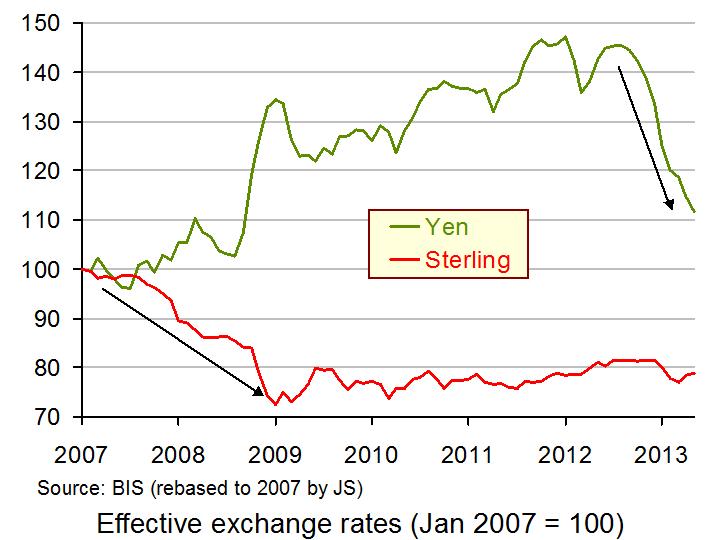 But will this depreciation succeed in stimulating the Japanese economy and will it improve the balance of trade? The hope is that the falling yen will boost export sales by making them cheaper abroad, and will reduce the demand for imports by making them more expensive in Japan. The balance of trade will thereby improve and higher exports (an injection) and lower imports (a withdrawal) will stimulate aggregate demand and economic growth.
Traditionally Japan has run balance of trade surpluses, but since July 2012, it has been running monthly deficits – the longest run of deficits since 1980. But depreciation cannot be expected to turn this position around immediately. Indeed, theory suggests that the balance of trade is likely to deteriorate before it improves. This is known as the J-curve effect and is illustrated in the second diagram below. As page 768 of Economics, 8th edition states:
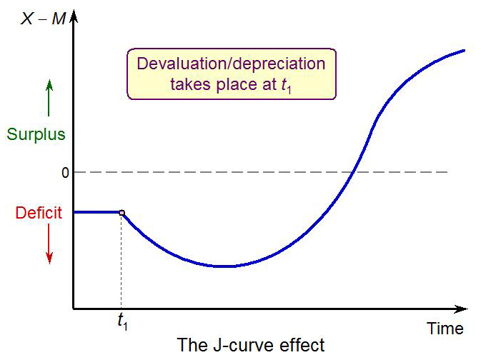 At first a devaluation or depreciation might make a current account deficit worse: the J-curve effect. The price elasticities of demand for imports and exports may be low in the short run (see Case Study 25.1 in MyEconLab). Directly after devaluation or depreciation, few extra exports may be sold, and more will have to be paid for imports that do not have immediate substitutes. There is thus an initial deterioration in the balance of trade before it eventually improves. In Figure 25.12 [the second diagram], devaluation takes place at time t1. As you can see, the diagram has a J shape.
Evidence suggests that the first part of the ‘J’ has been experienced in Japan: Japan’s balance of trade has deteriorated. But there is debate over whether the balance of trade will now start to improve. As the article by James Saft states:
But a look at the actual data shows Japanese companies, like British ones during a similar bout of currency weakness in 2008, appear to be more eager to use a newly competitive currency to pad profits through higher margins rather than higher export volumes. Thus far, Japanese exporters appear to be doing just that. Despite yen falls the price of Japanese exports in local currency has barely budged.
“Japanese companies have not actually cut the foreign currency prices of their exports. Just as with the UK exporters, the Japanese have chosen to hold foreign prices constant, maintain market share, and increase the yen value and thus the yen profit associated with yen depreciation,” UBS economist Paul Donovan writes in a note to clients.
 The extra profits earned by Japanese companies from export sales may be stockpiled or paid out in dividends rather than reinvested. And what investment does take place may be abroad rather than in Japan. The net effect may be very little stimulus to the Japanese economy.
As stated by Saft above, the UK had a similar experience in the period 2007–9, when sterling depreciated some 27% (see the second diagram). The balance of trade improved very little and UK companies generally priced goods to markets abroad rather than cutting overseas prices.
But times were different then. The world was plunging into recession. Now global markets are mildly growing or static. Nevertheless, there is a danger that the upward slope of the J-curve in Japan may be pretty flat.
Articles
Weak yen a boon for investors, not Japan Reuters, James Saft (14/5/13)
Japan’s Trade Data Suggest Even Lower Yen Needed Wall Street Journal, Nick Hastings (22/5/13)
2 Misunderstandings About Japanese Trade Seeking Alpha, Marc Chandler (22/5/13)
Japanese trade deficit widens Financial Times, Ben McLannahan (22/5/13)
Data
BIS effective exchange rate indices Bank for International Settlements
Japan’s balance of trade Trading Economics
UK Trade, March 2013 ONS
Questions
- Explain the J-curve effect.
- Why is there some doubt about whether the Japanese balance of trade will improve significantly?
- What will be the consequences for Japanese growth?
- If foreign currency prices of Japanese exports do not change, what will determine the amount that Japan exports?
- What other measures is the Japanese government taking to stimulate the economy? What will determine the size of the multiplier effects of these measures?
- Using data from the ONS plot the UK’s quarterly balance of trade figures from 2007 to the present day. Explain the pattern that emerges.
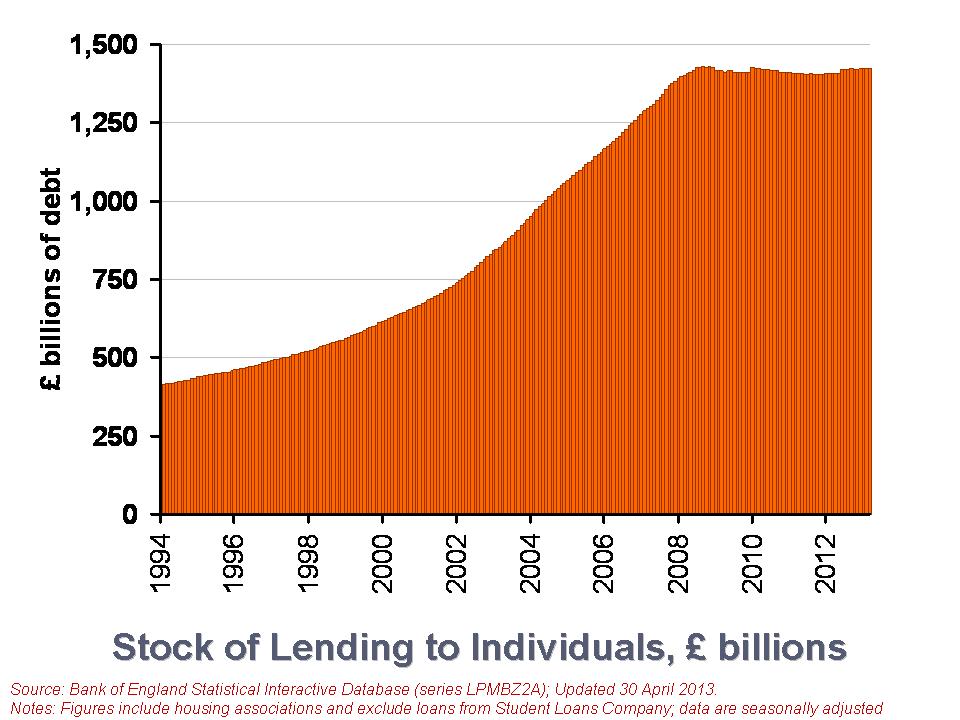 Have you ever woken in the night worrying about your finances? Most of us have. Our overall financial position undoubtedly exerts influence on our spending. Therefore, we would not expect our current spending levels to be entirely determined by our current income level.
Our financial health, or what economists call our net financial wealth, can be calculated as the difference between our financial assets (savings) and our financial liabilities (debt). Between them, British households have amassed a stock of debt of £1.423 trillion, almost as much as annual GDP, which is around £1.5 trillion (click here to download the PowerPoint.) We look here at recent trends in loans by financial institutions to British households. We consider the effect that the financial crisis and the appetite of individuals for lending is having on the debt numbers.
There are two types of lending to individuals. The first is secured debt and refers to loans against property. In other words, secured debt is just another name for mortgage debt. The second type of lending is referred to as unsecured debt. This covers all other forms of loans involving financial institutions, including overdrafts, outstanding credit card debt and personal loans. The latest figures from the Bank of England’s Money and Credit show that as of 31 March 2013, the stock of debt owed by individuals in the UK (excluding loans involving the Student Loans Company) was £1.423 trillion. Of this, £1.265 trillion was secured debt while the remaining £157.593 billion was unsecured debt. From this, we can the significance of secured debt. It comprises 89 per cent of the stock of outstanding debt to individuals. The remaining 11 per cent is unsecured debt.
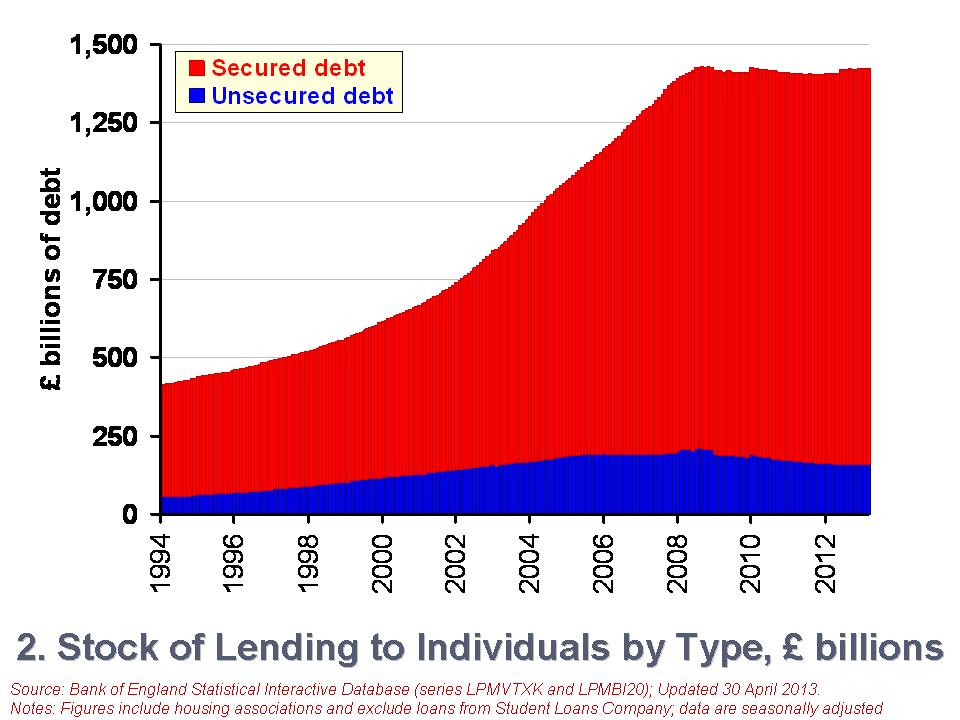 The second chart shows the growth in the stock of debt owed by individuals (click here to download the PowerPoint chart). In January 1994 the stock of secured debt stood at £358.75 billion and the stock of unsecured debt at £53.774 billion. 87 per cent of debt then was secured debt and, hence, little different to today. The total stock of debt has grown by 246 per cent between January 1994 and March 2013. Unsecured debt has grown by 197 per cent while secured debt has grown by 253 per cent.
However, more recently we see a different picture evolving, more especially in unsecured debt. Since October 2008, the monthly series of the stock of unsecured debt has fallen on 47 occasions and risen on only 7 occasions. In contrast, the stock of secured debt has fallen on only 12 occasions and often by very small amounts. Consequently, the stock of unsecured debt has fallen by 23.2 per cent between October 2008 and March 2013. In contrast, the stock of secured debt has risen by 3.5 per cent. The total stock of debt has fallen by 0.4 per cent over this period.
Another way of looking at changes in the stock of debt is to focus on what are known as net lending figures. This is simply the difference between the gross amount lent in a period and the amount repaid. The net lending figures will, of course, mirror changes in the total debt stock closely. For example, a negative net lending figure means that repayments are greater than gross lending. This will translate into a fall in the stock of debt. However, some difference occurs when debts have to be written off and not repaid.
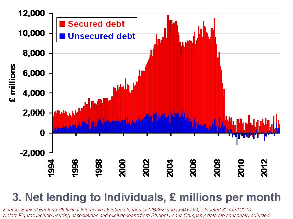 The third chart shows net lending figures since January 1994 (click here to download the PowerPoint chart). The chart captures the financial crisis very nicely. We can readily see a collapse of net lending by financial institutions to households. It is, of course, difficult to disentangle from the net lending figures those changes driven by changes in the supply of credit by financial institutions and those from changes in the demand for credit by individuals. But, we can be certain that the enormous change in credit levels in 2008 were driven by a massive reduction in the provision of credit.
To further put the net lending figures into context, consider the following numbers. Over the period from January 2000 to December 2007, the average amount of monthly net lending was £8.52 billion. In contrast, since January 2009 the average amount of net lending has been £691 million per month. Consider too the composition of this net lending. The average amount of net secured lending between January 2000 and December 2007 was £7.13 billion per month compared with £1.39 billion for net unsecured lending. Since January 2009, monthly net secured lending has averaged only £756 million while monthly net unsecured lending has averaged -£64.4 million. Therefore, repayments of unsecured lending have outstripped gross unsecured lending.
While further analysis is needed to fully understand the drivers of the net lending figures, it is, nonetheless, clear that the financial system of 2013 is very different to that prior to the financial crisis. This change is affecting the growth of the debt stock of households. This is most obviously the case with unsecured debt. The stock of unsecured debt in March 2013 is 24 per cent smaller than in its peak in September 2008. It is now the job of economists to understand the implications of how the new emerging patterns in household debt will affect our behaviour and overall economic activity.
Data
Money and Credit – March 2013 Bank of England
Statistical Interactive Database Bank of England
Articles
Bank of England extends lending scheme Financial Times, Chris Giles (24/4/13)
Markets insight: Europe and the US lines cross on household debt ratio Financial Times, Gillian Tett (9/5/13)
British families are the deepest in debt Telegraph, James Kirkup (14/5/13)
Total property debt of British households stands as £848bn Guardian, Hilary Osborne (13/5/13)
Household finances reach best level in three years – but are stuck below pre-crisis levels This is Money.co.uk, Matt West (17/5/13)
ONS says Welsh households have lowest debts in Britain BBC News (28/1/13)
Questions
- Outline the ways in which the financial system could impact on the spending behaviour of households.
- Why might the current level of income not always be the main determinant of a household’s spending?
- How might uncertainty affect spending and saving by households?
- Explain what you understand by net lending to individuals. How does net lending to individuals affect stocks of debt?
- Outline the main patterns seen in the stock of household debt over the past decade and discuss what you consider to be the principal reasons for these patterns.
- If you were updating this blog in a year’s time, how different would you expect the charts to look?
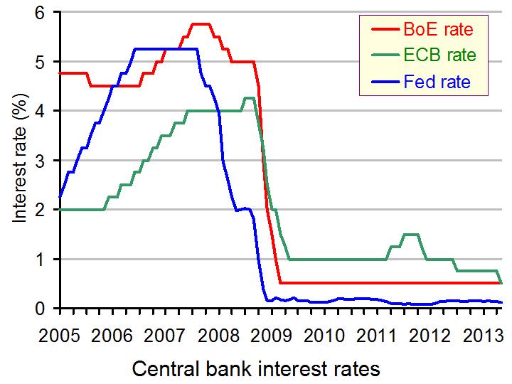 Interest rates have, for some years, been the main tool of monetary policy and of steering the macroeconomy. Across the world interest rates were lowered, in many cases to record lows, as a means of stimulating economic growth. Interest rates in the UK have been at 0.5% since March 2009 and on 2nd May 2013, the ECB matched this low rate, having cut its main interest rate from 0.75%. (Click here for a PowerPoint of the chart.)
Low interest rates reduce the cost of borrowing for both firms and consumers and this in turn encourages investment and can boost consumer expenditure. After all, when you borrow money, you do it to spend! Lower interest rates will also reduce the return on savings, again encouraging spending and for those on variable rate mortgages, mortgage payments will fall, increasing disposable income. However, these above effects are dependent on the banks passing the ECB’s main interest rate on its customers and this is by no means guaranteed.
Following the cut in interest rates, the euro exchange rate fell almost 2 cents against the dollar.
Interest rates in the eurozone have been at 0.75%, but a 0.25 point cut was widely expected, with the ongoing debt crisis in the Eurozone continuing to adversely affect growth and confidence. A lack of trust between banks has also contributed to a lack of lending, especially to small and medium sized enterprises. The ECB has injected money into financial institutions with the aim of stimulating lending, but in many cases, banks have simply placed this extra money back with the ECB, rather than lending it to other banks or customers. The fear is that those they lend to will be unable to repay the money. In response to this, there have been suggestions of interest rates becoming negative – that is, if banks want to hold their money with the ECB they will be charged to do it. Again, the idea is to encourage banks to lend their money instead.
Small and medium sized businesses have been described as the engine of growth, but it is these businesses who have been the least able to obtain finance. Without it, they have been unable to grow and this has held back the economic recovery. Indeed, GDP in the Eurozone has now fallen for five consecutive quarters, thus prompting the latest interest rate cut. A key question, however, will be how effective this quarter of a percent cut will be. If banks were unwilling to lend and firms unwilling to invest at 0.75%, will they be more inclined at 0.5%? The change is small and many suggest that it is not enough to make much of a difference. David Brown of New View Economics said:
The ECB rate cut is no surprise as it was well flagged by Draghi at last month’s meeting. Is it enough? No. The marginal effect of the cut is very limited, but at least it should have some symbolic rallying effect on economic confidence.
This was supported by Howard Archer at HIS Global Insight, who added:
Admittedly, it is unlikely that the trimming of interest rates from 0.75% to 0.5% will have a major growth impact, especially given fragmented credit markets, but any potential help to the eurozone economy in its current state is worthwhile.
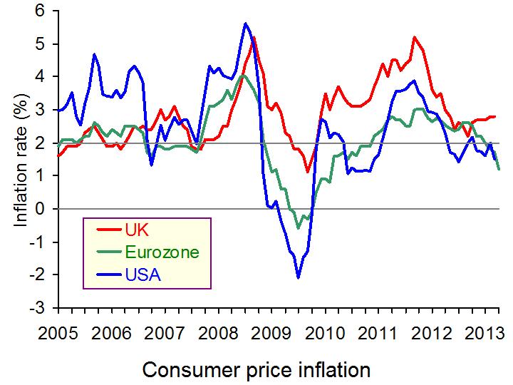 Inflation in the eurozone is only at 1.2%, which is significantly below the ceiling of 2%, so this did give the ECB scope for the rate to be cut. (Click here for a PowerPoint of the chart.) After all, when interest rates fall, the idea is to boost aggregate demand, but with this, inflation can emerge. Mr Draghi said ‘we will monitor very closely all incoming information, and assess any impact on the outlook for price stability’. The primary objective of the ECB is the control of inflation and so had inflation been somewhat higher, we may have seen a different decision by the ECB. However, even then, 5 consecutive quarters of negative growth is hard to ignore.
So, if these lower interest rates have little effect on stimulating an economic recovery, what about a movement away from austerity? Many have been calling for stimulus in the economy, arguing that the continuing austerity measures are stifling growth. The European Council President urged governments to promote growth and job creation. Referring to this, he said:
Taking these measures is more urgent than anything … After three years of firefights, patience with austerity is wearing understandably thin.
However, Mr. Draghi urged for policymakers to stick with austerity and continue to focus on bringing debt levels down, while finding other ways to stimulate growth, including structural reform. The impact of this latest rate cut will certainly take time to filter through the economy and will very much depend on whether the 0.5% interest rate is passed on to customers, especially small businesses. Confidence and trust within the financial sector is therefore key and it might be that until this emerges, the eurozone itself is unlikely to emerge from its recession.
ECB ready to enter unchartered waters as bank cuts interest rate to fresh low of 0.5pc The Telegraph, Szu Ping Chan (2/5/13)
Draghi urges Eurozone governments to stay the course on austerity Financial Times, Michael Steen (2/5/13)
Eurozone interest rates cut to a record low of 0.5% The Guardian, Heather Stewart (2/5/13)
ECB’s Draghi ‘ready to act if needed’ BBC News (2/5/13)
Eurozone interest rates cut again as ECB matches Bank of England Independent, Russell Lynch (3/5/13)
Margio Draghi urges no let-up in austerity reforms after Eurozone rate cut – as it happened The Guardian, Graeme Wearden (2/5/13)
ECB cuts interest rate to record-low 0.5% in desperate measure to drag Eurozone out of recession Mail Online, Simon Tomlinson and Hugo Duncan (2/5/13)
ECB cuts interest rates, open to further action Reuters, Michael Shields (2/5/13)
Eurozone loosens up austerity, slowly Wall Street Journal (2/5/13)
ECB cuts interest rate, not enough to pull the region out of recession The Economic Times of India (2/5/13)
Euro steady ahead of ECB interest rate announcement Wall Street Journal, Clare Connaghan (2/5/13)
 European Central Bank (ECB) cuts interest rates BBC News (2/5/13)
All eyes on ECB as markets expect rate cut Financial Times, Michael Steen (2/5/13)
Questions
- How is a recession defined?
- Using an aggregate demand/aggregate supply diagram, illustrate and explain the impact that this cut in interest rates should have.
- On which factors will the effectiveness of the cut in interest rates depend?
- Using the interest rate and exchange rate transmission mechanisms to help you, show the impact of interest rates on the various components of aggregate demand and thus on national output.
- What would be the potential impact of a negative interest rate?
- Why did the low inflation rate give the ECB scope to cut interest rates?
- What are the arguments for and against austerity measures in the Eurozone, given the 5 consecutive quarters of negative growth?
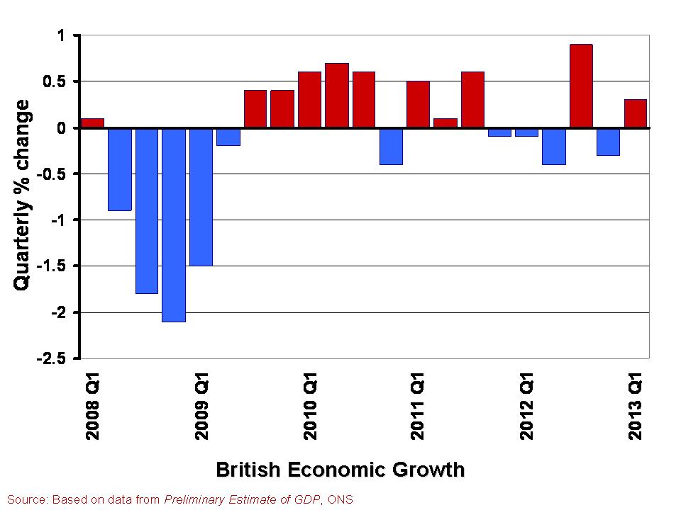 In The global economy we note the mixed picture contained within the latest British growth numbers. With the first estimate of growth for Q1 of 2013 pointing to an increase in real GDP of 0.3 per cent, the UK economy appears to have missed the ignominy of a triple dip recession. However, the overall economy remains fragile with different sectors of the economy performing quite differently.
A patchy picture is perhaps the fairest assessment. This helps to explain the quite different perceptions amongst economists, business people, journalists and the wider public about the current state of the economy. Here we consider in a little more detail the growth numbers for the UK from the latest preliminary GDP estimates. (Click here for a PowerPoint of the chart).
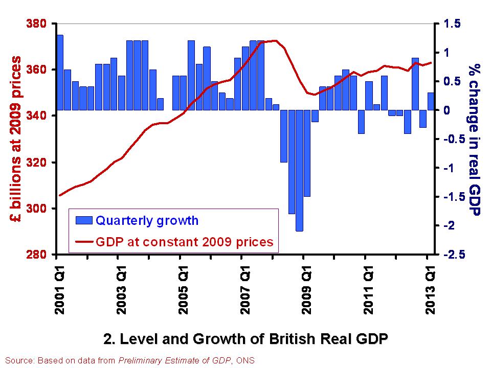 The British economy is thought to have grown by 0.3 per cent in the first quarter of 2013. This follows a contraction of 0.3 per cent in the final quarter of 2012. Compared with the first quarter of 2012, the output of the British economy was 0.6 per cent higher. However, as Chart 2 helps to show, the British economy has some way to go before it returns to the levels seen prior to the financial crisis. Real GDP peaked in the first quarter of 2008 when GDP at 2009 prices was estimated at £372.7 billion. In the first quarter of 2013, GDP at constant 2009 prices is estimated at £362.9 billion. This means that the economy is still 2.6 per cent smaller than its 2008-peak. Click here for a PowerPoint of the chart.
The patchy nature of British growth is illustrated nicely by the contrasting rates of growth across the different industrial sectors in the first quarter of the year. While service sector output rose by 0.6 per cent, output across the production industries rose by only 0.2 per cent and agricultural output declined by 3.7 per cent. Within the production industries, mining and quarrying output rose by 3.2 per cent, but manufacturing output shrunk by 0.3 per cent and construction output shrunk by 2.5 per cent.
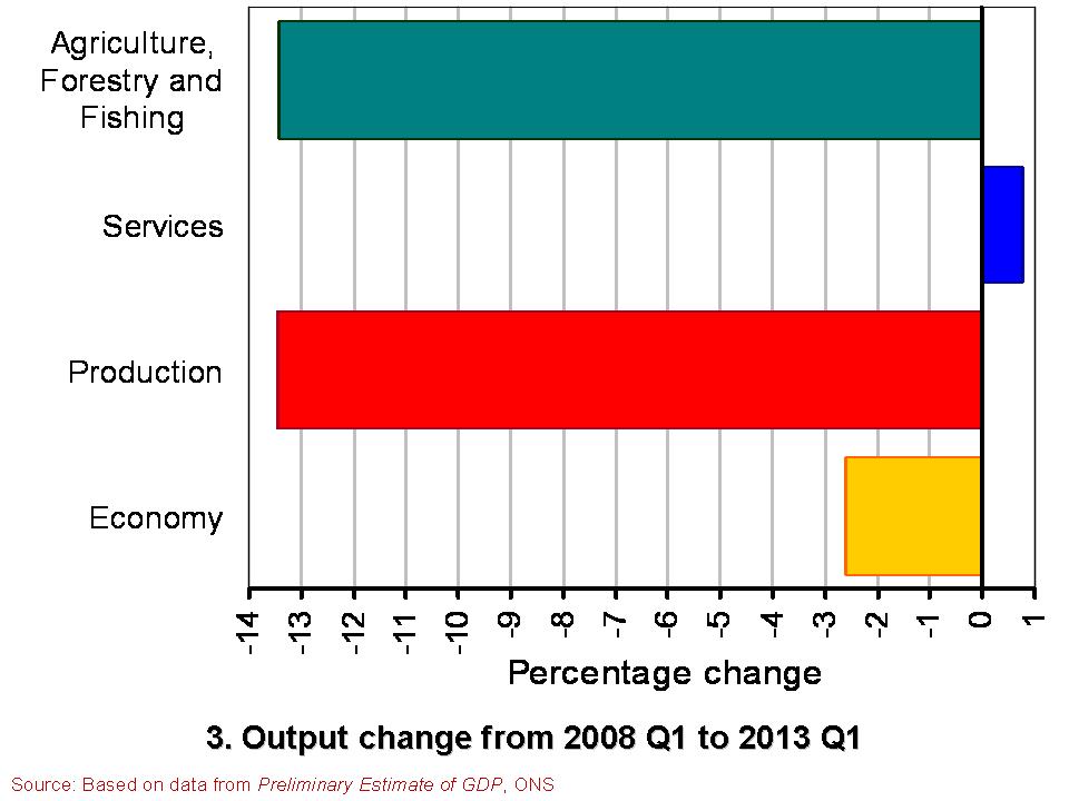 Chart 3 compares the output of agriculture, the production industries and the service sector between the first quarter of 2008 and the first quarter of 2013. (Click here for a PowerPoint of the Chart). It shows the dramatically different experience of the service sector compared with agriculture and the production industries. While output in the service sector is now 0.8 per cent higher, output across agriculture and the production industries is almost 13.5 per cent lower. Within the production industries, output in mining and quarrying is 38 per cent lower, in the construction sector 19 per cent lower and 10 per cent lower in manufacturing. It is perhaps not surprising then that we get such different messages about the state of the economy. The devil really is in the detail.
Data
Preliminary Estimate of GDP – Time Series Dataset Q1 2013 Office for National Statistics
Statistical Bulletin: Gross Domestic Product Preliminary Estimate Q1 2013 Office for National Statistics
Articles
UK avoids triple-dip recession with better-than-expected 0.3% GDP growth Guardian, Heather Stewart (25/4/13)
UK economy shows 0.3% growth Financial Times, Claire Jones (25/4/13)
UK avoids triple-dip recession with 0.3pc GDP growth Telegraph, Szu Ping Chan (25/4/13)
Osborne claims UK economy is ‘healing’ Financial Times, George Parker and Claire Jones (25/4/13)
UK narrowly escapes triple-dip recession as GDP figures show 0.3% growth in first three months of year Independent, Ben Chu (25/4/13)
UK economy avoids triple-dip recession BBC News (25/4/13)
Questions
- What is the difference between nominal and real GDP? Which of these helps to track changes in economic output?
- How would we identify a recession in either of the first two charts?
- What is a double-dip recession? What is a triple-dip recession?
- The UK economy in Q1 2013 was 2.6 per cent smaller than in Q1 2008. What factors do you think help explain why after 5 years UK real GDP is still lower?
- Why if output in the production and agricultural sectors is 13.5 per cent lower in Q1 2013 compared to Q1 2008 is the economy’s total output only 2.6 per cent lower?
- Economic growth rates fluctuate quite significantly. Can economic theory help to explain why this is the case?