 According to a an article in The Guardian, The best news in the world, by the president of the World Bank, Jim Yong Kim, there has been a dramatic fall in global poverty over the past two decades. The number of people in extreme poverty is projected to fall this year to below 10% of global population for the first time. This has been made possible, he claims, by unprecedented economic growth, especially in China.
But this raises three questions.
The first is whether, in the face of falling growth rates, progress in poverty reduction can be maintained.
The second is whether the World Bank is measuring extreme poverty in the right way. It is now defined as living on less than US$1.90 a day in 2011 prices – until a few weeks ago is was $1.25 in 2005 prices. As a result of this rebasing, global poverty falls from 14.5% of the world’s population (or 1011 million people) under the old method to 14.2% (or 987 million) under the new.
The third question is whether countries can improve their data collection so that a truer estimate of poverty can be made.
As far as the first question is concerned, Kim states that to stimulate growth, ‘every dollar of public spending should be scrutinised for impact. Every effort must be made to improve productivity.’ What is more, three things must happen:
|
|
| • |
Economic growth must lift all people. It must be inclusive. |
| • |
Investment in human beings is crucial – especially investing in their health and education. Malnourished and poorly educated children will never reach their full potential and countries, in turn, will fall short of their economic and social aspirations. |
| • |
We must ensure that we can provide safety nets that prevent people from falling back into poverty because of poor health, economic shocks, or natural disasters. |
As far as the second question is concerned, there are many who argue that $1.90 per day is far too low a measure of the extreme poverty threshold. It is a purchasing-power parity measure and is equivalent to what $1.90 would buy in the USA in 2011.  But, according to the Jason Hickel article linked below, ‘the US Department of Agriculture calculates that in 2011 the very minimum necessary to buy sufficient food was $5.04 per day. And that’s not taking account of other requirements for survival, such as shelter and clothing.’ Peter Edward of Newcastle University, claims Hickell, ‘calculates that in order to achieve normal human life expectancy of just over 70 years, people need roughly 2.7 to 3.9 times the existing poverty line.’
But even if living on below $1.90 a day is defined as extreme poverty, it is important not to see the problem of poverty as having been solved for people who manage to achieve an income slightly above that level.
The third question is how to improve data. There is a paucity and unreliability of data in many developing countries. According to Kim:
Our report adds that data is sparse and inconsistent across the region and globally. Some 29 countries around the world had no poverty data from 2002 to 2011, so they could not track their progress. Another 28 had just one survey that collected poverty data during that time.
This is a situation that must change to improve the world’s ability to tackle poverty. In fact, we can’t accomplish our goal if we do not have enough information to know whether people are actually lifting themselves out of poverty. For that we need to address huge data gaps. We need robust data.
Articles
The best news in the world: we have made real progress towards ending extreme poverty The Guardian, Jim Yong Kim (3/11/15)
Could you live on $1.90 a day? That’s the international poverty line The Guardian, Jason Hickel (1/11/15)
Making international trade work for the world’s poorest The Guardian, Jim Yong Kim and Roberto Azevêdo (30/6/15)
Global Poverty Will Hit New Low This Year, World Bank Says Huffington Post, Lydia O’Connor (23/10/15)
The international poverty line has just been raised to $1.90 a day, but global poverty is basically unchanged. How is that even possible? World Bank blogs, Francisco Ferreira, Dean Mitchell Jolliffe and Espen Beer Prydz (4/10/2015)
Why Didn’t the World Bank Make Reducing Inequality One of Its Goals? World Bank blogs, Jaime Saavedra-Chanduvi (23/9/13)
$1.90 Per Day: What Does it Say? Institute for New Economic Thinking, Rahul Lahoti and Sanjay Reddy (6/10/15)
Reports and papers
The Role of Trade in Ending Poverty WTO and World Bank (2015)
Poverty in a Rising Africa World Bank (1/10/15)
Ending extreme poverty and sharing prosperity: progress and policies World Bank, Marcio Cruz, James Foster, Bryce Quillin and Philip Schellekens (October 2015)
Questions
- Explain how the World Bank calculates the extreme poverty line.
- Why, if the line has risen from $1.25 per day to $1.90 per day, has the number of people recorded as being in extreme poverty fallen as a result?
- Why has the number of people in extreme poverty been rising over the years and yet the percentage of people in extreme poverty been falling?
- What policies can be adopted to tackle poverty? Discuss their practicality?
- Are reduced poverty and increased economic growth consistent policy goals? (See the blog post Inequality and economic growth.)
- What are the inadequacies of using income per day (albeit in ppp terms) as a measure of the degree of poverty? What other indicators of poverty could be used and how suitable would they be?
- How could international trade be made to work for the world’s poorest?
 In a recent post, we looked at the rising number of people being paid less than the (voluntary) living wage. The Living Wage Foundation has just published the latest annual update to the living wage. This brings it to £9.40 per hour in London and £8.25 outside London – well above the statutory National Minimum Wage of £6.70 for those aged 21 and over. Even when employers are required to pay at least the so-called National Living Wage (NLW) of £7.20 per hour from April 2016 to those aged 25 and over, the NLW will still be well below the living wage.
Read the earlier post and then answer the questions in the light of the new living wage rates and the new linked articles.
Articles
Living wage rate increased by 40p an hour BBC News (2/11/15)
London ‘living wage’ rises to £9.40 an hour Financial Times, Sarah O’Connor (2/11/15)
Living Wage now £8.25 across the UK and £9.40 in London Independent, Jon Stone (2/11/15)
Special report: The Living Wage and its impact on workers and businesses Manchester Evening News, Adam Jupp (2/11/15)
Living Wage: Number Of Employers Paying It Doubles In A Year, While Six Million Workers Still Go Without Huffington Post, Jack Sommers (2/11/15)
Living wage rate increases announced as campaigners call for more businesses to go beyond legal minimums Living Wage Foundation (30/10/15)
Data and Reports
Estimates of employee jobs paid less than the living wage in London and other parts of the UK ONS (12/10/15)
Annual Survey of Hours and Earnings ONS
Living wage rates: the calculation Living Wage Foundation
National Minimum Wage rates GOV.UK
Questions
- By referring to the Living Wage Foundation site, explain how the living wage is calculated. If you were defining the living wage, would you define it in this way? Explain.
- Distinguish between low pay and poverty. Does pay give a good indication of poverty?
- For what reasons has the number of jobs paying below the living wage increased? Does marginal productivty theory provide an explanation?
- Is it best to base statutory minimum wages on median earnings, mean earnings or the cost of living? Explain.
- If more 6 million jobs pay below the living wage, does this mean that 6 million people, more than 6 million people or fewer than 6 million people receive average hourly wages below the living wage? Explain.
- For what reasons might firms volunteer to pay the living wage to their employees? Is doing so consistent with the aim of profit maximisation?
- Why are more women than men paid wage rates below the living wage?
- Why does the proportion of people being paid the living wage vary from one part of the UK to another? Is this likely to be purely a reflection of differences in the cost of living?
In 2014, 19% of jobs in London and 23% of jobs outside London paid less than the living wage. This is according to figures just published by the Office for National Statistics. The figures compare with 17% and 22% respectively in 2013. The problem is that while the living wage rises with the cost of living, median wages have not kept pace with prices: in other words, in real terms median wages have fallen.
The living wage has been calculated annually since 2003 for London by the London Mayor’s Office and since 2011 for the rest of the UK by the Centre for Research in Social Policy (CRSP) at Loughborough University for the Living Wage Foundation.
According to the London Mayor’s Office:
The London Living Wage is an hourly rate of pay, calculated according to a combination of the costs of living in London and 60% of the median wage. This gives the wage rate needed to give a worker in London enough to provide their family with the essentials of life, including a cushion against unforeseen events. Unlike the compulsory national minimum wage, the London Living Wage is a voluntary commitment made by employers, who can become accredited with the Living Wage Foundation.
As the Chart 1 illustrates, the living wage is above the National Minimum Wage. 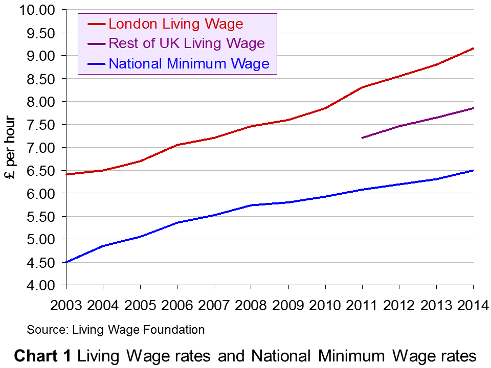 Since November 2014, the living wage in London has been £9.15 in London and £7.85 in the rest of the UK. It is due to be uprated at the beginning of November 2015. From 1 October 2014 to 30 September 2015, the National Minimum Wage (for people aged 21 and over) was £6.50. It rose to £6.70 on 1 October 2015.
Note that the (voluntary) living wage is different from the compulsory ‘National Living Wage’ announced by the Chancellor in his July 2015 Budget, which will come into effect in April 2016 as a top-up to the National Minimum Wage (NLW) for those aged 25 and over. This will be only 50p above the National Minimum Wage and thus considerably below the living wage, 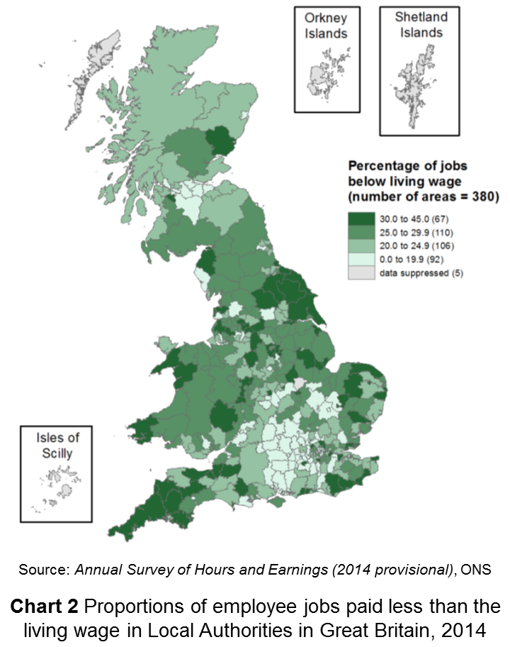 although the Chancellor has pledged to increase the NLW to 60% of median wage rates for those aged 25 and over by 2020. According to the Office for Budget Responsibility, “the NLW will rise from £7.20 in April 2016 (equivalent to around 55 per cent of estimated median hourly earnings for employees aged 25 and over) to around £9.35 in April 2020 (reaching 60 per cent of expected median hourly earnings for that group) in steps that imply the rise relative to median hourly earnings is a straight line.”
The percentage of people being paid below the living wage varies by occupation, location of jobs (see map in Chart 2 – click to enlarge), sex and age and whether the job is full or part time. For example, in accommodation and food services, in retail and in sales and customer services, more than half the jobs paid less than the living wage. A greater percentage of women than men were paid below the living wage (29% and 18% respectively outside London). As far as young people are concerned, 48% of 18–24 year olds were paid less than the living wage in London and 58% outside London 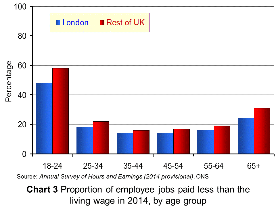 (see Chart 3). In London 45% of part-time jobs paid less than the living wage; in the rest of the UK the figure was 43%.
As The Guardian article linked below reports:
A spokesman for the Living Wage Foundation, which sets the figure each year, said despite ‘significant progress’ in many sectors, more jobs than ever were below the voluntary rates.
“These figures demonstrate that while the economy may be recovering as a whole, there is a real problem with ensuring everyone benefits, and low pay is still prevalent in Britain today,” he said.
The following articles look at the evidence presented by the ONS and examine the incidence of low pay in the UK.
Articles
More jobs paying below living wage BBC News (12/10/15)
A fifth of UK jobs pay less than living wage – ONS Financial Times (12/10/15)
The proportion of workers not being paid the living wage is rising Independent, Jon Stone (12/10/15)
Almost 30 per cent of women are paid below the living wage Independent, Jon Stone (12/10/15)
More UK jobs fail to pay a living wage The Guardian, Hilary Osborne and Damien Gayle (12/10/15)
Six million jobs pay below the living wage Full Fact, Laura O’Brien (19/10/15)
Data and Reports
Estimates of employee jobs paid less than the living wage in London and other parts of the UK ONS (12/10/15)
Annual Survey of Hours and Earnings ONS
Living wage rates: the calculation Living Wage Foundation
National Minimum Wage rates GOV.UK
Questions
- By referring to the Living Wage Foundation site, explain how the living wage is calculated. If you were defining the living wage, would you define it in this way? Explain.
- Distinguish between low pay and poverty. Does pay give a good indication of poverty?
- For what reasons has the number of jobs paying below the living wage increased? Does marginal productivty theory provide an explanation?
- Is it best to base statutory minimum wages on median earnings, mean earnings or the cost of living? Explain.
- If 6 million jobs pay below the living wage, does this mean that 6 million people, more than 6 million people or fewer than 6 million people receive average hourly wages below the living wage? Explain.
- For what reasons might firms volunteer to pay the living wage to their employees? Is doing so consistent with the aim of profit maximisation?
- Why are more women than men paid wage rates below the living wage?
- Why does the proportion of people being paid the living wage vary from one part of the UK to another? Is this likely to be purely a reflection of differences in the cost of living?
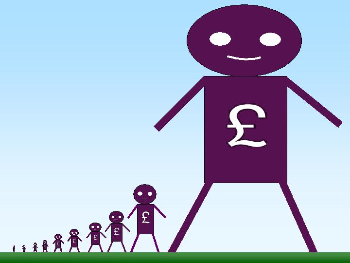 In his 1971 book, Income Distribution, Jan Pen, a Dutch economist, gave a graphic illustration of inequality in the UK. He described a parade of people marching by. They represent the whole population and the parade takes exactly one hour to pass by. The height of each person represents his or her income. People of average height are the people with average incomes – the observer is of average height. The parade starts with the people on the lowest incomes (the dwarfs), and finishes with those on the highest incomes (the giants).
Because income distribution is unequal, there are many tiny people. Indeed, for the first few minutes of the parade, the marchers are so small they can barely be seen. Even after half an hour, when people on median income pass by, they are barely waist high to the observer.
The height is growing with tantalising slowness, and forty-five minutes have gone by before we see people of our own size arriving. To be somewhat more exact: about twelve minutes before the end the average income recipients pass by.
In the final minutes, giants march past and then in the final seconds:
the scene is dominated by colossal figures: people like tower flats. Most of them prove to be businessmen, managers of large firms and holders of many directorships and also film stars and a few members of the Royal Family.
The rear of the parade is brought up by a few participants who are measured in miles. Indeed they are figures whose height we cannot even estimate: their heads disappear into the clouds and probably they themselves do not even know how tall they are.
Pen’s description could be applied to most countries – some with even more dwarfs and even fewer but taller giants. Generally, over the 43 years since the book was published, countries have become less equal: the giants have become taller and the dwarfs have become smaller.
The 2011 Economist article, linked below, uses changes in Gini coefficients to illustrate the rise in income inequality. A Gini coefficient shows the area between the Lorenz curve and the 45° line. The figure will be between 0 and 1 (or 0% and 100%). a figure of 0 shows total equality; a figure of 1 shows a situation of total inequality, where one person earns all the nation’s income. The higher the figure, the greater the inequality.
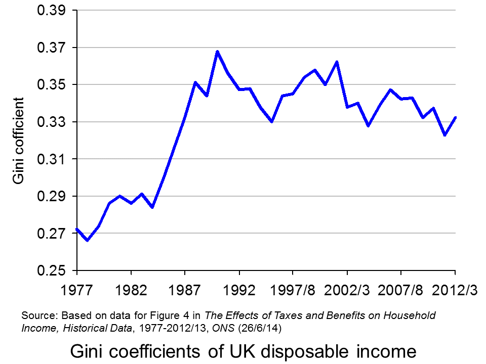 The chart opposite shows changes in the Gini coefficient in the UK (see Table 27 in the ONS link below for an Excel file of the chart). As this chart and the blog post Rich and poor in the UK show, inequality rose rapidly during the years of the 1979–91 Thatcher government, and especially in the years 1982–90. This was associated with cuts in the top rate of income tax and business deregulation. It fell in the recession of the early 1990s as the rich were affected more than the poor, but rose with the recovery of the mid- to late 1990s. It fell again in the early 2000s as tax credits helped the poor. It fell again following the financial crisis as, once more, the rich were affected proportionately more than the poor.
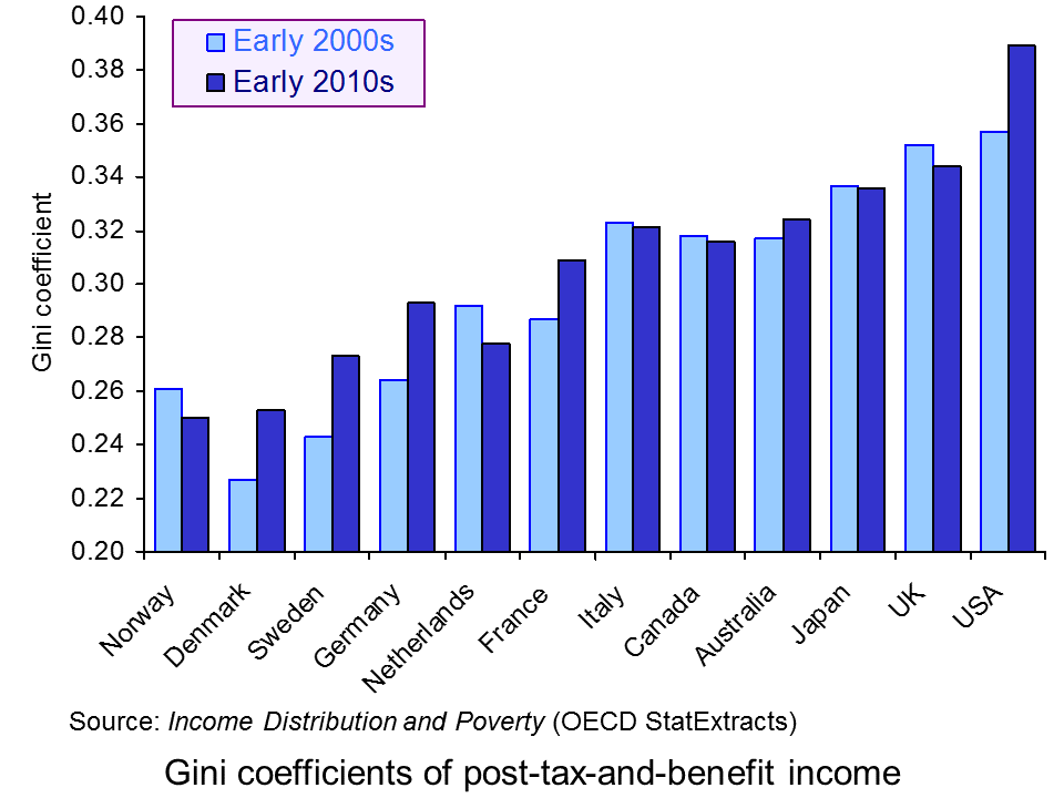 The most up-to-date international data for OECD countries can be found on the OECD’s StatExtracts site (see chart opposite: click here for a PowerPoint). The most unequal developed county is the USA, with a Gini coefficient of 0.389 in 2012 (see The end of the American dream?), and US inequality is rising. Today, the top 1% of the US population earns some 24% of national income. This compares with just 9% of national income in 1976.
Many developing countries are even less equal. Turkey has a Gini coefficient of 0.412 and Mexico of 0.482. The figure for South Africa is over 0.6.
When it comes to wealth, distribution is even less equal. The infographic, linked below, illustrates the position today in the USA. It divides the country into 100 equal-sized groups and shows that the top 1% of the population has over 40% of the nation’s wealth, whereas the bottom 80% has only 7%.
So is this inequality of income and wealth desirable? Differences in wages and salaries provide an incentive for people to work harder or more effectively and to gain better qualifications. The possibility of increased wealth provides an incentive for people to invest.
But are the extreme differences in wealth and income found in many countries today necessary to incentivise people to work, train and invest? Could sufficient incentives exist in more equal societies? Are inequalities in part, or even largely, the result of market imperfections and especially of economic power, where those with power and influence are able to use it to increase their own incomes and wealth?
Could it even be the case that excessive inequality actually reduces growth? Are the huge giants that exist today accumulating too much financial wealth and creating too little productive potential? Are they spending too little and thus dampening aggregate demand? These arguments are considered in some of the articles below. Perhaps, by paying a living wage to the ‘tiny’ people on low incomes, productivity could be improved and demand could be stimulated.
Infographic
 Wealth Inequality in America YouTube, Politizane (20/11/12)
Articles
The rise and rise of the cognitive elite The Economist (20/1/11)
Inequality in America: Gini in the bottle The Economist (26/11/13)
Pen’s Parade: do you realize we’re mostly dwarves? LVTFan’s Blog (21/2/11)
Here Are The Most Unequal Countries In The World Business Insider, Andy Kiersz (8/11/14)
Inequality in the World Dollars & Sense, Arthur MacEwan (Nov/Dec 14)
Britain is scared to face the real issue – it’s all about inequality The Observer, Will Hutton (19/1/14)
The tame inequality debate FundWeb, Daniel Ben-Ami (Nov 14)
Is inequality the enemy of growth? BBC News, Robert Peston (6/10/14)
Data
GINI index World Bank data
List of countries by income equality Wikipedia
The Effects of Taxes and Benefits on Household Income, 2012/13 ONS (see table 27)
Income Distribution and Poverty: Gini (disposale income) OECD StatExtract
Questions
- Distinguish between income and wealth. Is each one a stock or a flow?
- Explain how (a) a Lorenz curve and (b) a Gini coefficient are derived.
- What other means are there of measuring inequality of income and wealth other than using Gini coefficients (and giants and dwarfs!)?
- Why has inequality been rising in many countries over the years?
- How do (a) periods of rapid economic growth and (b) recessions affect income distribution?
- Define ‘efficiency wages’. How might an increase in wages to people on low incomes result in increased productivity?
- What is the relationship between the degree of inequality and household debt? What implications might this have for long-term economic growth and future financial crises? Is inequality the ‘enemy of growth’?
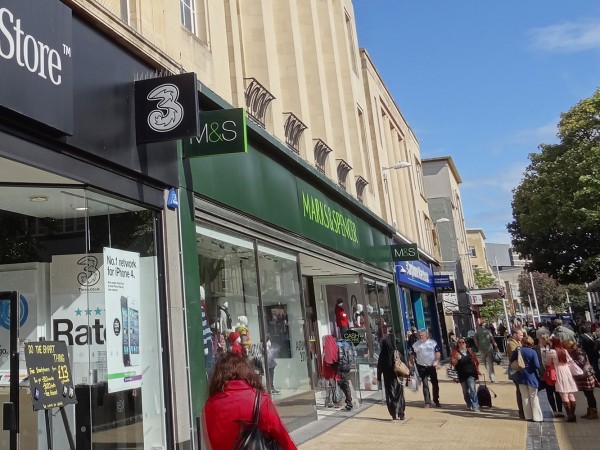 The typical UK high street is changing. Some analysts have been arguing for some time that high streets are dying, with shops unable to face the competition from large supermarkets and out-of-town malls. But it’s not all bad news for the high street: while some types of shop are disappearing, others are growing in number.
Part of the reason for this is the rise in online shopping; part is the longer-term effects of the recession. One consequence of this has been a shift in demand from large supermarkets (see the blog, Supermarket wars: a pricing race to the bottom). Many people are using local shops more, especially the deep discounters, but also the convenience stores of the big supermarket chains, such as Tesco Express and Sainsbury’s Local. Increasingly such stores are opening in shops and pubs that have closed down. As The Guardian article states:
The major supermarket chains are racing to open high street outlets as shoppers move away from the big weekly trek to out-of-town supermarkets to buying little, local and often.

Some types of shop are disappearing, such as video rental stores, photographic stores and travel agents. But other types of businesses are on the increase. In addition to convenience stores, these include cafés, coffee shops, bars, restaurants and takeaways; betting shops, gyms, hairdressers, phone shops and tattoo parlours. It seems that people are increasingly seeing their high streets as social places.
Then, reflecting the widening gap between rich and poor and the general desire of people to make their money go further, there has been a phenomenal rise in charity shops and discount stores, such as Poundland and Poundworld.

So what is the explanation? Part of it is a change in tastes and fashions, often reflecting changes in technology, such as the rise in the Internet, digital media, digital photography and smart phones. Part of it is a reflection of changes in incomes and income distribution. Part of it is a rise in highly competitive businesses, which challenge the previous incumbents.
But despite the health of some high streets, many others continue to struggle and the total number of high street stores across the UK is still declining.
What is clear is that the high street is likely to see many more changes. Some may die altogether, but others are likely to thrive if new businesses are sufficiently attracted to them or existing ones adapt to the changing market.
How the rise of tattoo parlours shows changing face of Britain’s high streets The Guardian, Zoe Wood and Sarah Butler (7/10/14)
The changing face of the British High Street: Tattoo parlours and convenience stores up, but video rental shops and travel agents down Mail Online, Dan Bloom (8/10/14)
High Street footfall struggles in August Fresh Business Thinking, Jonathan Davies (15/9/14)
Ghost town Britain: Internet shopping boom sees 16 high street stores close every day Mail Online, Sean Poulter (8/10/14)
Questions
- Which of the types of high street store are likely to have a high income elasticity of demand? How will this affect their future?
- What factors other than the types of shops and other businesses affect the viability of high streets?
- What advice would you give your local council if it was keen for high streets in its area to thrive?
- Why are many large superstores suffering a decline in sales? Are these causes likely to be temporary or long term?
- How are technological developments affecting high street sales?
- What significant changes in tastes/fashions are affecting the high street?
- Are you optimistic or pessimistic about the future of high streets? Explain.
 According to a an article in The Guardian, The best news in the world, by the president of the World Bank, Jim Yong Kim, there has been a dramatic fall in global poverty over the past two decades. The number of people in extreme poverty is projected to fall this year to below 10% of global population for the first time. This has been made possible, he claims, by unprecedented economic growth, especially in China.
 But, according to the Jason Hickel article linked below, ‘the US Department of Agriculture calculates that in 2011 the very minimum necessary to buy sufficient food was $5.04 per day. And that’s not taking account of other requirements for survival, such as shelter and clothing.’ Peter Edward of Newcastle University, claims Hickell, ‘calculates that in order to achieve normal human life expectancy of just over 70 years, people need roughly 2.7 to 3.9 times the existing poverty line.’